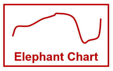
Thought-provoking
I first read about the “elephant chart” in Edward Luce’s The Retreat of Western Liberalism (affiliate link), where the author explained how income inequality was a key factor in the global rise of protectionism and angry populism. Surprisingly, the middle class of rich OECD countries were the one who felt disenfranchised, left behind, and generally unloved. Luce argues convincingly that Trump’s election in the US, Brexit in the UK were symptoms of this mega-trend.
PBS has a 7 min video below which does a great job explaining the chart here.
Economist Branko Milanovic
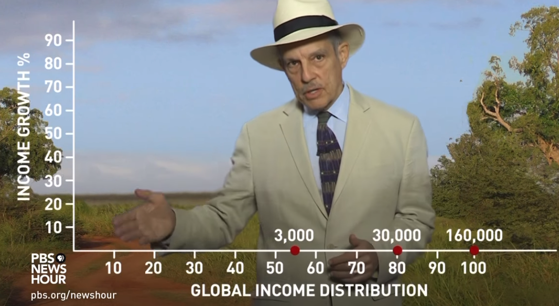
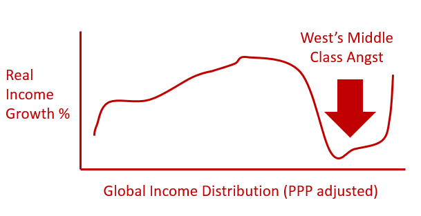
He graphed 20 years of income data and adjusted it for inflation and taxes etc, so that it was an apples-to-apples comparison for people globally. Yes, if you want to super geek-out, here are the data sets. As shown below (ignore the guy in the hat), the chart shows the global income distribution (based on 1988 income) on the X axis. The global poor on the left, and the global rich on the right. The Y axis shows how much their income grew over 20 years. Based on 1988 dollars:
- A family (of four people) living on $3K a year was at the 55% percentile (first red dot)
- A family living on $30K annually would be at the 80th percentile (second red dot)
- A family 160K a year would put you into the global 1%. (Note: this is all after-tax dollars)
The bottom half win
Anyone reading the Economist, or watching the news knows that the bottom half of the global income distribution did well over the last 30 years. Global GDP growth has been good. Let’s agree – global trade works. China and India have successfully pulled hundreds of millions of people out of poverty. South Korea, Brazil have done great. Bill Gates notes in his annual report that we (the global we) have made great gains in malnutrition, vaccines, and a host of other indicators of quality life. Awesome. Super-winning.
The top 1% win
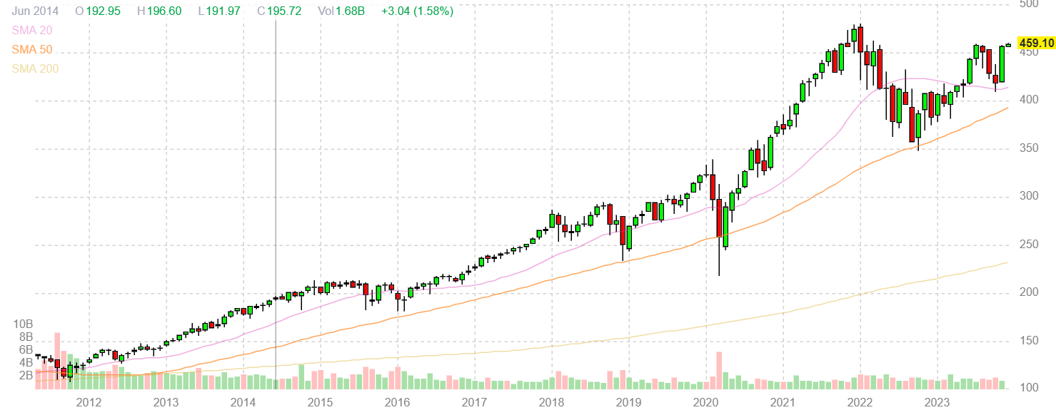
This is also no surprise. Asset prices have been booming. Look at this chart of SPY (S&P tracking ETF). Essentially tripled since the end of 2011. Do I wish more people owned growth equities and invested for their future? Yes.
So who were the losers?
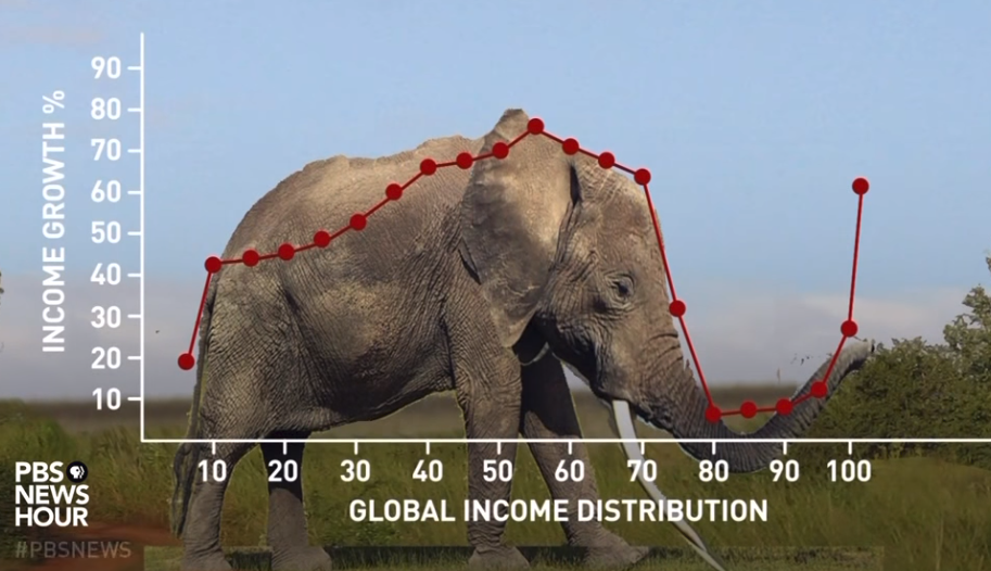
So here comes the surprise. Of all the groups globally, it was the folks who were at the 75-95% ranking globally who saw almost no after-tax income growth. The OECD middle class income is stalling out. Shocking because this crew is used to living well. Upper middle class right? These are the small shop owners, office workers, factory workers, retail workers, service workers. Insurance sales people, mechanics, craftspeople, teachers, bank tellers, drivers, healthcare workers, restaurant servers – in the US, Spain, France, Japan, South Korea, UK, Germany, Canada, Australia, and Italy.
Look at the chart below
This is the part of the chart where the elephant’s snout drops to the floor. If your income is between 75-95% of the global income ladder, you saw no real income growth. This sucks for you. Globalization is helping the bottom half of the income distribution (from the tail to the head of the elephant), and the super-rich (elephant’s tip of the trunk), but not for those in the G7 middle class.
The “middle class” of Liverpool, Lynchburg, Lyon, and Leipzig are not any better off than they were 20 years ago. Hmm.
The global average is good
Yes, overall the world is richer (global trade works, hat-tip Adam Smith), but averages are misleading. There is a lot of angst for those who make between $70K and $90 annually. “They are feeling fear from both ends — from one end because the other people are catching up to them and from the other, as people from their own countries are moving further and further ahead.”
Dissatisfaction is understandable
If you or your parents are in this situation, this stinks. No real wage growth for 20+ years. Sure, you have job insecurity. Sadly, this often leads to over-simplistic, and often mean-hearted things. Xenophobia. Anti-immigrant sentiment. “Why can’t we be rich like we used to be?”
Challenge to policy makers
For the Economist-reading, Milton Friedman-types like myself, we will always be proponents of global trade as the smartest, long-term way to increase global wealth. As with anything vaguely market-based, there are some winners and losers in this transition. Policy makers in the developed OECD countries really contemplate this chart:
- How can we transition our economy to super value-added jobs, appropriate for our citizen’s opportunity cost?
- How can we build an economy with real wage growth available to everyone, not just those who own assets (stocks, bonds, real estate)?
- How can we create an environment which encourages free-flow of labor to their greatest utility?
- How do we manage expectations for a slower-growth future?
Hustle
Finally, Thomas Friedman made it very clear that the World is Flat (affiliate link). We have the pressure, privilege, ability, curse, freedom, and mission to prove our value through our words and deeds. It is a gig economy. The days when the government, the company, the “anything” would provide you entitlements are gone / going away.
Gratitude
For me, there is a real lack of thankfulness in the world. Overall, no one actually got poorer during the last 20+ years, which is an accomplishment. Also, if you look at the elephant chart, look at the poorest among us. The people who like on $2 a day. Those folks were living on $2 a day in 1988, and now they are living on $2.40.

Not exactly content related, but wouldn’t this chart have been easier to read as a bar graph? Took me a minute to interpret the info on the line graph because there really is no relationship between the elements on the X-axis. Then again, might lose the elephant angle is that was the case… ?
True on both counts. Bar charts are so direct, which is awesome. And yes, would have definitely lost the elephant in that.
Great point that if it takes the viewer more than 5-6 seconds to understand the chart – probably can be shown more succinctly some other way. Agreed.