Death by PowerPoint
Presentations can be boring. We have all sat in large conference rooms held captive by a speaker wielding a poorly thought-out PowerPoint. To misquote a bumper sticker, “PowerPoints don’t kill, people do.”
Don’t put lipstick on a pig
Some people respond to this problem by trying to “spice up” their presentations with animation, photos, or colorful font. Definitely a poor choice. Since most of us consume 10+ hours of media daily with all our computers, iPads, TVs, smart phones, we are a pretty jaded group. Clip art is not going to impress. It’s like putting lipstick on a pig, or putting a leather-bound cover on a poorly written essay.
Keep it simple
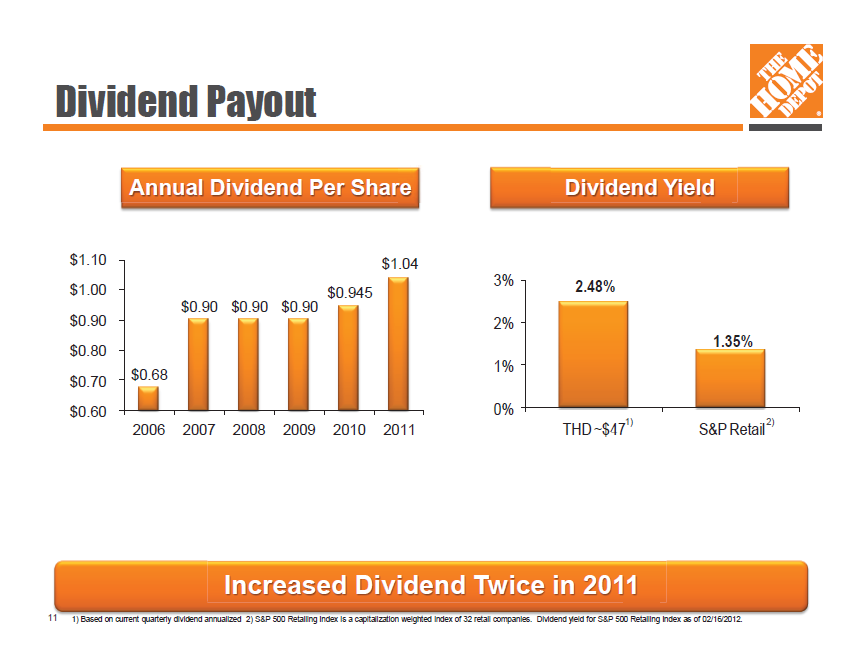
Simple is often the most effective. The slide below is from a presentation made by Home Depot at the Raymond James investor conference on 3/16/12. Even the casual viewer can see the main points of the slide within 10 seconds:
- Dividends were flat for several year, but were up in 2011
- Home Depot dividends are almost double of their retail competitors

If it is good enough for McKinsey and Company. . .
Most people know that McKinsey and Company is a top strategy management consulting and is considered one of the most prestigious places to work. What many people don’t know is that prior to 2009, McKinsey printed most of their client charts in black and white. Color and graphics can help, but are not required. Unsurprisingly, content is king.
What should you focus on?
- Create a clear storyline and make it easy to follow along
- Put things into buckets that make sense to the audience
- Write great titles; make it obvious
Related Posts:
