What’s the so what?
You will hear this phrase used on projects a fair amount. It is not the best usage or even politely worded, but it’s critical:
Your presentations need to have a point
Since consultants are paid for insights, recommendations and results (and often paid on an hourly rate), clients understandably get impatient when it looks like we are wasting time. You can also envision the Death by PowerPoint meeting where the consultant is simply regurgitating back things the client already knows. The client is thinking, “I could have told you that. Come on! Get on with it already.”
If your manager says, “What’s the so what?”
Your PowerPoint slide (report, or update) is not saying anything. It is just data, or information – which is generally not a good thing. Here are a few ways to fix it:
Improve the content or flow
1. Analysis: Get off the couch and dig deeper into the data. Link it to other data, group it differently, run regression, look for outliers, find the “a ha” insight
2. Story-telling: Take a step back and see how this slide fits in the overall narrative. Does it belong somewhere in the presentation? Is it even necessary?
Make it easier to understand
3. Writing: Write tighter bullets. Get rid of the jargon, long-winded prose, strange sentence fragments and other poor writing hygiene
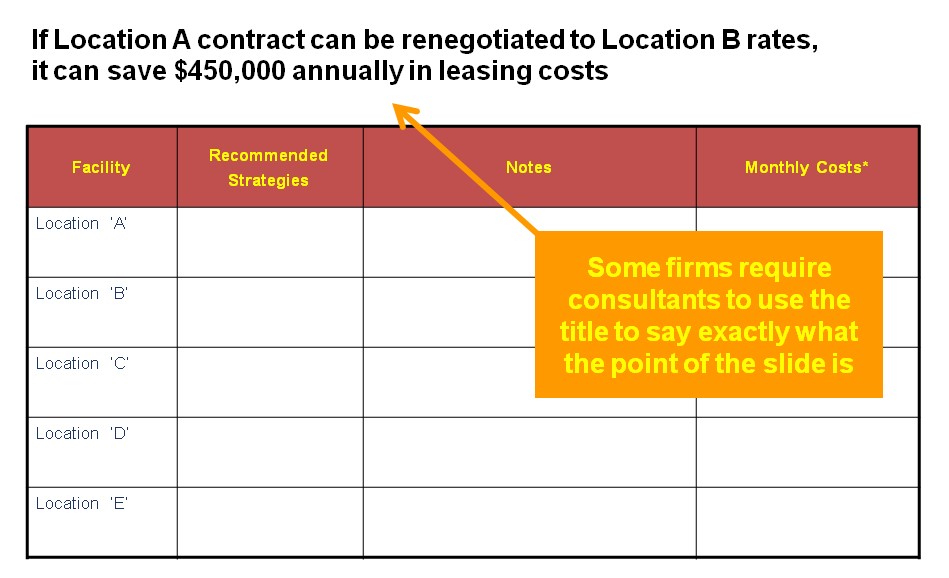
4. Title: Rewrite the title so it says exactly what you want the reader to understand

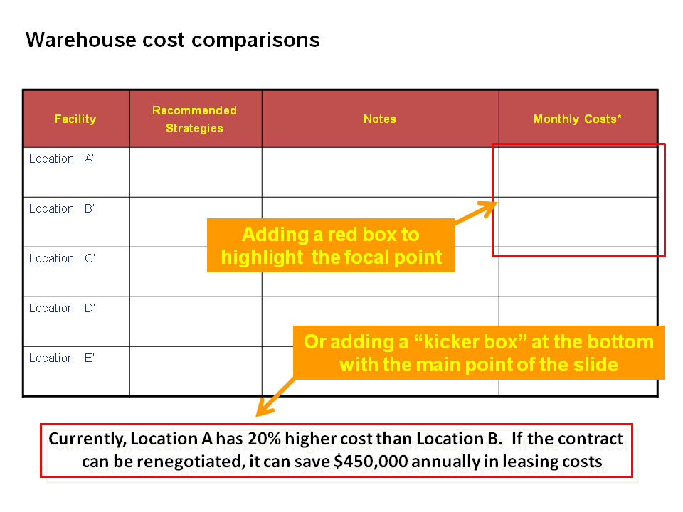
5. Highlights: Emphasize your point by using different colors, or using a call-out box (sometimes called “kicker box”) to reiterate the point at the bottom of the slide

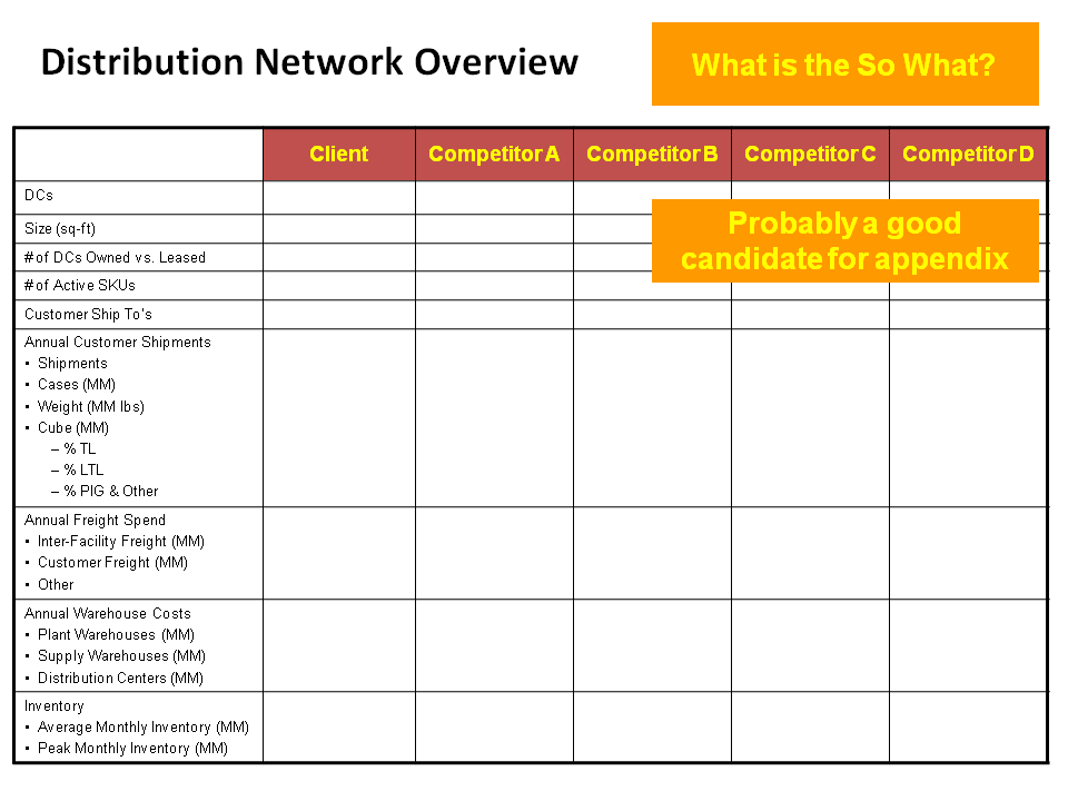
6. Appendix: Don’t fall in love with your work. If the slide is informative, but does not have a compelling point. . . worst case, move it to the appendix.


I’m introducing consulting techniques to my colleagues within a Utility business in Hong Kong. I’ve been developing training material that describes the ‘Headers’ and ‘Kicker-Box’ technique you describe. I’d like to give attribution for the various techniquies I’m introducing, but I can’t seem to find anything about who developed the ‘Header-Kicker’ method – any ideas?
Interesting question. Without researching, I imagine that it is more related to visual design and marketing psychology. Putting copy closer to places where readers draw their eye. Also, I know that many PowerPoint templates have the “kicker” built in . . .almost forcing the author to use it a method to emphasize the title.
Also, let’s remember that many books have Titles, and subtitles too. A great book on this general topic is ON ADVERTISING by David Ogilvy. A classic.
Very good post, basic principles need to be reminded from time to time. I just realized that my consultancy has never trained us on how to compile a good deck, probably that’s why some consultants are not able to produce something that is neat and comprehensible for the client who’s twice our age and not very skilled at reading fancy graphs.
Yes. A lot of the big four or big three are pretty maniacal about following their formatting m; but that does not mean it is clear or easy to follow.
In terms of fancy graphs, my opinion differs from people on my team. I abide by the McKinsey idea that each slide and/or graph makes 1 point. Ergo, graphs should be simple and as “in your face” obvious as possible.
Sounds like you are like me. I collect good presentations. Always something to learn.
Does anyone have a sample of great presentations that they wouldn’t mind sharing… Need some inspiration
Hello, there are hundreds of good ones at slideshare.net If you are looking for more management consulting (read: data-driven, logical, perhaps a bit dry) then here you go: https://www.consultantsmind.com/tag/presentations/