What’s the so what?
You will hear this phrase used on projects a fair amount. It is not the best usage or even politely worded, but it’s critical:
Your presentations need to have a point
Since consultants are paid for insights, recommendations and results (and often paid on an hourly rate), clients understandably get impatient when it looks like we are wasting time. You can also envision the Death by PowerPoint meeting where the consultant is simply regurgitating back things the client already knows. The client is thinking, “I could have told you that. Come on! Get on with it already.”
If your manager says, “What’s the so what?”
Your PowerPoint slide (report, or update) is not saying anything. It is just data, or information – which is generally not a good thing. Here are a few ways to fix it:
Improve the content or flow
1. Analysis: Get off the couch and dig deeper into the data. Link it to other data, group it differently, run regression, look for outliers, find the “a ha” insight
2. Story-telling: Take a step back and see how this slide fits in the overall narrative. Does it belong somewhere in the presentation? Is it even necessary?
Make it easier to understand
3. Writing: Write tighter bullets. Get rid of the jargon, long-winded prose, strange sentence fragments and other poor writing hygiene
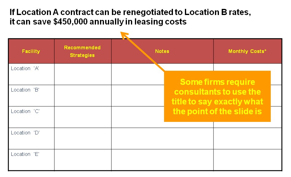
4. Title: Rewrite the title so it says exactly what you want the reader to understand

5. Highlights: Emphasize your point by using different colors, or using a call-out box (sometimes called “kicker box”) to reiterate the point at the bottom of the slide
6. Appendix: Don’t fall in love with your work. If the slide is informative, but does not have a compelling point. . . worst case, move it to the appendix.
