Consultants spend hours making slides
It’s a common sight to see consultants pouring over their PowerPoint slides – moving pages around, adjusting the colors on graphs, mulling over wording, checking verb agreement and proof-reading. Presentations are also called “deliverables” because they are the products that we deliver to clients. It is a core part of the job, but commonly misunderstood. Reality is that consultants use PowerPoints.
Is this excessive or a waste of time?
Who knows, some might even think it is narcissistic – like someone who spends too much time in front of the mirror in the morning. After all, isn’t it the content that is important? Why bother with all the structured presentation? Couldn’t this all just be put into a written document or memo?
“Oh, you are so good making pretty presentations.”
I have heard this more than once and it drives me a little crazy. The “pretty” part of the presentation is the equivalent of choosing the garnish for a plate of pasta, or the jacket design for a book. Are clients paying $250-$500 per billable hour for presentation jockeys? Doubt it.
Why so much PowerPoint?
1. It forces brevity.
Good presentations are succinct. They may have a 60 page appendix, but the executive summary will be terse and have a point of view. Using the analogy of a tree, the presentation is the fruit. The consultant may have paid their dues with endless late nights, analysis and interviews, but the end result is a presentation. There is no glory in showing the client all the gory details. You need to really boil it down to its essence. Apply the 80/20 principle, and give the client only the good stuff. Harvard Business School essays have a limit of 400 words, which is damn tough to do.
I would have written a shorter letter, but I did not have the time – Blaise Pascal, mathematician logician, physicist

2. Executives are short on time
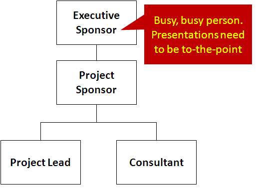
Often times, the executive sponsor of a project will really only commit 10-12 hours of total time for a 4 month project. The client project lead will be working with you on a day-to-day basis, but you have to remember that executives are short on time, and long on opinion. They are not going to read a 100 page MS Word doc.

3. Communication is the goal
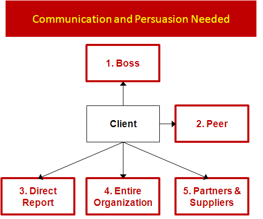
Consultants are hired to effectively solve problems. This often means persuading people to take action. It’s not enough to put smart things on paper; there needs to be results. Often times, pieces and parts of the presentation are used by the client to “sell” the recommendation to other people – the boss, peers and others. Think head, heart, and hand.
4. Executives are visual people
Maybe it’s because they deal with lots of information (reports, emails etc) every day. Maybe they just watch too much TV like everyone else. Graphs, tables, lists, groups, diagrams all help to convey a lot of information in a concise way. Each of the shapes below can help convey meaning. They are archetype frameworks. Read posts of Nancy Duarte’s Slideology here, here, and here.

- Stage-gate process – narrowing down of options, projects, investment ideas
- Phases of a project – start, middle, and end
- Venn diagram – the overlap of 2 distinct things
- S curve – the evolution, growth, and plateau of a function
- 2 x 2 matrix – simple X vs. Y axis
5. Most people are terrible at it
This might be counter-intuitive, or just cynical, but most people are terrible at putting together compelling presentations. Just go to www.slideshare.net and randomly look up presentations. They are generally awful. Full of text, no narrative, no takeaway. They are essentially a compilation of facts, or a copy/paste from a document.
Big win for consultants. As long as people are crappy at distilling complex problems into easy-to-follow, logical recommendations that are easily communicated to executives. . . more billable hours for us consultants.

Thanks for this. I actually moved away from “SmartArt” to “Shapes” after reading this post of yours and the results are amazing!
What do you use for your flow-charts and other visual tools? They look simple and neat.
Thanks for the comment. Yes, I think simpler is better. For flow-charts, I use MS PowerPoint. It is less trouble than MS Visio, and also easier for clients to use (after you leave them the documents). There are other free software too: https://www.lucidchart.com/
If you are like me, you will start to collect good presentations – because it is useful to see how other people used graphics to tell a story.
I like the way you structure a post: give overview of the post first, and then sequentially lay out the argument. Reminds me how some of the Buddha’s discourses are set.
You talked about collecting good presentations. Any tips/pointers to start that? Anywhere I can go to get “seed” collection to build upon?
Aditya,
If you are in a consulting firm, naturally, that is a great place to find, trade, and collect PPT. If not, you would be surprised to see how many corporate PPT are floating around the web. If you type in any consulting firm’s name + presentation, you will see lots of deliverables out there.
A few that I found immediately. Most of them are pdf, but it certainly gives you a good idea of how consulting firms structure arguments.
Bain on China Luxury Goods market
http://www.bain.com/Images/2011%20Bain%20China%20Luxury%20Market%20Study.pdf
BCG presentation to LA Harbor Commission
http://www.portofoakland.com/pdf/ctmp_03.pdf
McKinsey on China Customer Insights
http://www2.dupont.com/Packaging_Graphics/en_AU/assets/downloads/pdf/grandprix/InsightsChina_McKinsey.pdf
Just a few to get you started. . .
Therapy! Making the image right is science not just art. Sadly all too often an attempt is made to make a presentation to appeal to everyone – yes the message may be relatively the same but sometimes that’s as far as the similarity goes. If you’re struggling to make it clear brief and relevant perhaps (to coin a phrase) you’re trying to kill too many birds with one stone.
Hello, thank you for the comment. Yes, completely agree that adapting the ppt to the right audience is key. I remember there was a final presentation that we presented separately to 3 different audiences before we brought the 3 groups together for a final report out. In Japanese, they call it “nemawashi” or pre-wiring the meeting so you vet the naysayers privately and early, then it is easier for the larger group to come to a concensus. Cheers.
Some people use it for diagramming while 99% is using for presentation (slides) purposes. However some people use creately visio like diagram tools to create presentations.
Agreed.
Best idea is to simply ditch powerpoint. If you can’t explain an issue without dozens of slides then you don’t understand it yourself. Ask yourself, is this slide for me or for the client and why the hell am I keeping it there. The client is buying your brain and your personality, not slides. People are by and large intelligent beings and can digest what they here. If you want to enhance a presentation with images to excite and engage then great. But data on a screen bamboozles and is unmemorable.
Like it. The best meetings are the ones where you don’t even go through slides. Agreed. Yet, I think I have made slides on every project I have been on. Sadly.
I struggled with the concept of “why PowerPoint?” when I was a junior consultant.
After years I try to explain it as a) you are writing a report not a presentation b) you need to write a visual and impactful presentation that your client takes and shares c) PowerPoint is the most widely available, easy to use DTP tool to do the job.
The fact that 99.9% we use the same report as a presentation is just a bonus.
Thanks for sharing your experience. I also find that a lot of times PowerPoint is very useful for us consultants too . . to force us to distill our thoughts.