Charts can mislead
In most cases, bad charts are accidental. Perhaps someone was over-eager to show good results, or maybe, just did a sloppy job of formatting. Whatever the cause, it’s bad mojo to put together analyses or charts that mislead. Here are some bad examples from Starbucks’ recently investor conference. You can see all the slides here. After some time, you will see many misleading graphs.
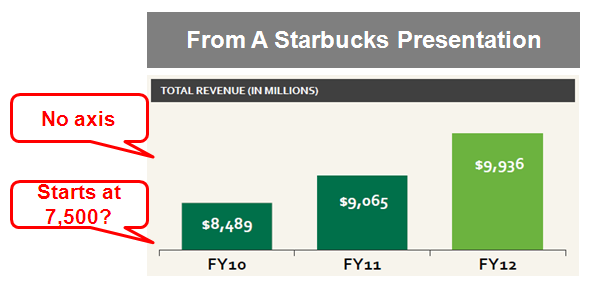
#1. No axis label
This is no-no. A chart without a labeled X&Y axis is like a car without an odometer. Not a good idea.

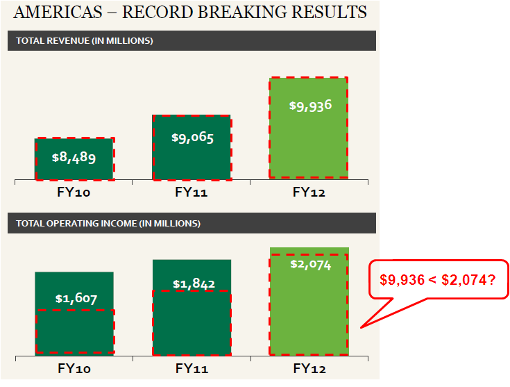
#2. Not drawn to scale
Below, you can see that Starbucks is comparing its revenue with operating income. Since the scale is different, the operating income actually looks bigger than revenue. That ain’t right.
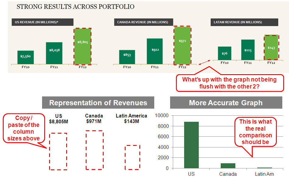
3. False or unnecessary comparisons
Same problem below. The coffee executives compare US & Canada & Latin America but use different – seemingly random – scales. Misleading graphs, I tell you.
The 2012 revenues are shown with red dotted lines. When you line them up, they look similar in size – when in reality – it should look like the graph at the bottom right. The US is where the current revenues come from and Latin America is a rounding error.
Why make the comparison?
There was no reason to compare the US, Canada and Latin America. They are at different stages of their growth. Why force the comparison?
Comparing the US and Canada makes sense
They are both mature markets with similar GDP per headcount and analogous cultures. Taking the population for the US and Canada here, you can see that the average American and Canadian spends about the same on Starbucks annually.

Analyze Latin America by itself or against emerging markets
Looking at Latin America over the last 3 years, looks like they went from $76M to $115M to $143M. Nothing shabby about that. Why not focus on that story separately.
Clarity is your job
At the core, a consultant’s job is to drive clarity – through the data, analysis, and presentation. Anything you do to over-simplify, obfuscate, or muddle the issue is bad. The client can be confused by themselves – without paying your fees.


Thanks for the post – good points and common with other firms too.
But I think obfuscation must be in the Starbucks culture. In the UK we have recently discovered the extent of Starbucks tax avoidance: they pay high internal transfer fees to low tax subsidiaries in other countries for ‘procurement costs’ and ‘licencing’ costs. This means that although Starbucks boasts about its UK profitability to analysts, they have actually paid negligible corporation tax (on profits). This is not illegal, but a Parliament committee has tagged it immoral and gave the CEO a more thorough roasting than Starbucks probably give their beans.
So far the Starbucks share value has reduced by 10% and the chain has been subject to consumer boycotts. Starbucks have since made an offer to pay voluntary tax, but this has not gone down well with other corporate and personal tax payers who don’t have that option!
Thanks for your comment. Yes, too many people are sloppy with their presentations – which is both disingenuous and unprofessional. Shame of them, and also shame on the audience that don’t catch the tricks.
SBUX. Have read both of Shultz’s books POUR YOUR HEART INTO IT, and ONWARD. Want SBUX to be exceptional, but looks like they are falling victim to their success and size. Seems like companies tend to regress to the mean (of mediocrity) with size, and age. The inertia takes over.