Consulting presentations are simpler
90%+ of presentations will be on PowerPoint and only use simple graphs with very straight-forward messages. It’s a good thing because executives look for compelling recommendations, not cutesy graphics.
As I noted in another post, McKinsey & Company printed their client presentations in black and white prior to 2009. For them, the strength was in the analysis and clarity of argument. If “simple” is good enough for McKinsey, it is good enough for you and me.
So why bother?
A cynic might ask, “So why should a consultant even bother looking at infographics, if they are not the type of graphics we use with clients?”
Answer: It’s good for you
It’s easy for us to get set in your ways. We need to feed our minds new ideas and new ways to improve our craft. It’s instructive to see how professional graphic designers represent data – even if you apply it later in a more toned-down or straight-laced way.
1. Learn to build an argument
In Osama vs. Air Travel: The Post 9-11 Effect on Travel, see how the designer combined data to show the impact of 9/11 on US travel patterns.
2. See how others analyze data
You can take the most mundane data and do amazing things with it. Look at this analysis of the Songs that Metallica Played on Stage during 1982-2012. It’s amazing to see how many ways they sliced the 30 years of data.
3. Yes, crass examples too
Many of the infographics use classic consulting tools like fishbone diagrams, venn diagrams, pie charts, waterfalls. See this Taxonomy of Sh*t which is just an affinity diagram. Albeit, a vulgar one.
4. Learn from bad examples
There are examples where the designers goes overboard and makes the data confusing. In Texting While Driving, you can see a muti-layered pie chart that takes about 30 seconds to fully decipher. Do not do this.
The main point is simple – that young people text while driving – but the graphic is unnecessarily ornate and confusing. Also, it is bad graphics hygiene because the age groups are unequal: 16-19 (4 yrs), 20-24 (4 yrs), 25-34 (10 yrs), 35-44 (10 yrs)?
5. Enjoy the creativity
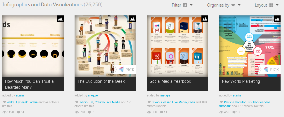
Live a little and enjoy the creativity. Face it, data analysis, pivot tables, MiniTab, and Powerpoint can get boring. Check out the How Much You Can Trust a Bearded Man? and see if you agree with their analysis.
Another savant analyzed the color palette of 10 artists over the same 10 year period. I swear, there are some creative people out there. More right-brained than I am.
Let me know when you find great infographics, I will add it below.

