

At the time I had no idea where it would lead, but after 40,000+ words I still enjoy the work. As consultants, we are paid by to think rigorously and creatively through problems – and yet, it’s a shame there is not a place to catalog thoughts. Folders full of PowerPoint presentations seem insufficient and hollow.
What did I write about?
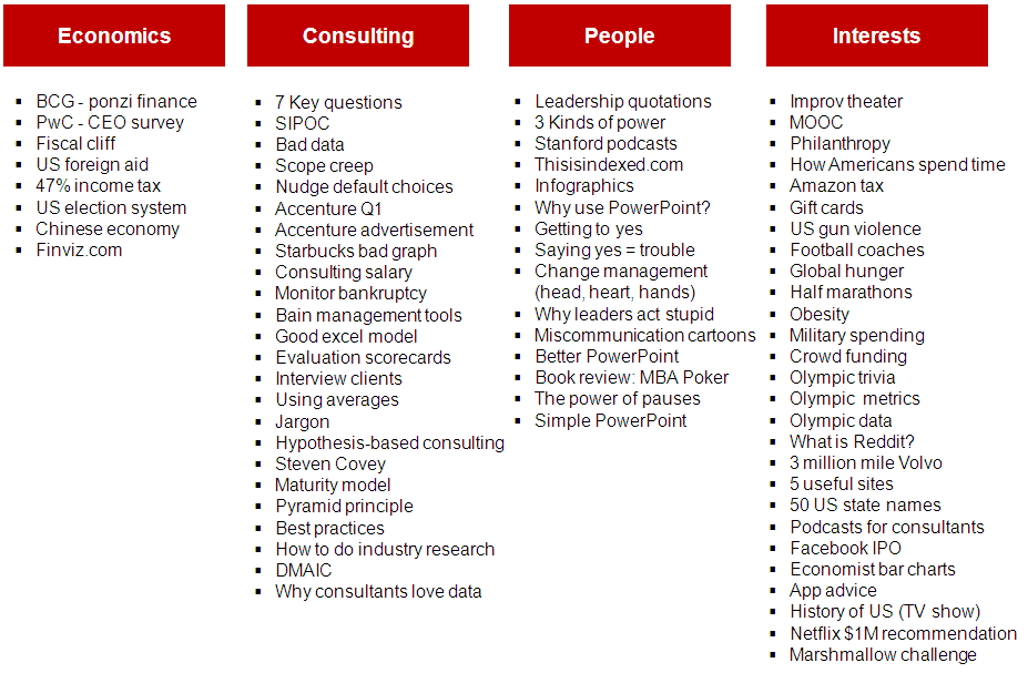
Looking back, these are the topics. If any of that is of interest, you can type in key words in the search box on the top right of the site. I see there was a lot about random topics like Amazon.com’s tax rate, half marathons and MOOCs. I suppose that is the nice thing about a hobby – you can follow your interests.

There were about 27,000+ views over the last 12 months. While that might seem like a lot, it isn’t. My wife frequents a recipe website run by a home-cook that gets that many views daily. I guess if I measured success by page views I would have lots of Chicken Florentine, and cous cous recipes. heh heh.
Where are the visitors from?
Since I write in English, it’s no surprise most views come from English-speaking countries ( US, UK, India, Canada etc). That said, honored that people are also stumbling across the blog from all over the world. 100+ countries.
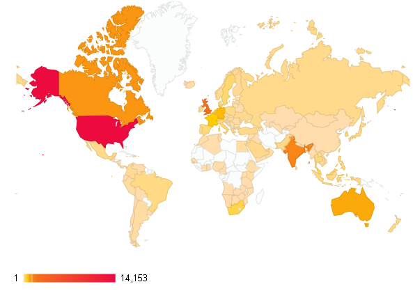

One of my friends is a huge advocate for tables. He rightly claims that people spend too much time pretty-ing up charts or maps (like the one above), when a simple table conveys more information. Here is shows that 52% of page views came from the US, followed by UK, India, and Canada. There is a long tail.
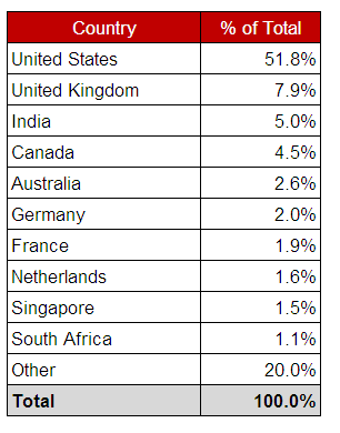
How many views were there each month?
Like many things, the growth is non-linear. Starts off slow (non-existent really), then starts to accumulate and grow (more posts + better Google search rankings + RSS + email readers).
The blue chart shows the total number of monthly views.
The red chart shows the average number of monthly views per post. As a consultant, I would probably focus more on the red chart since it normalizes results for the number of posts. Comparing May & October you can see on the blue chart it shows more than double the number of views. Lots of growth, right?
Well, when you adjust for the number of posts that were written during those 5 months, you can see that the average number of views per post (shown in red) was actually less.
What’s next?
Look forward to melding my passion of consulting with education. Will write more about the disruptive innovation in education and applying consulting to everyday problems. My friends and I have some of the best conversations – and look forward to sharing some of that on this site. If you have topics you want to discuss or think through, please let me know. Best regards,
