Bain & Company is known for big thinking
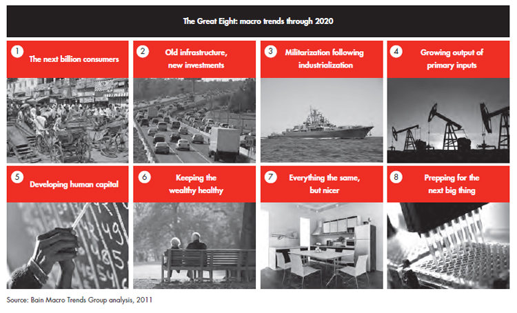
This 44 page report is no exception. Bain reviews eight global trends that will each generate a $ trillion+ of growth. Trillion with a T. Look at the concepts below, and you can see this big-think, Alvin Toffler-type thinking. It’s written in a fairly straight-forward way and pretty convincing. If you invest in stocks, these are all macro-economic filters that you could you might use to narrow down stock picks.

The Great Eight: Trillion Dollar Growth Trends
This is by Karen Harris, Austin Kim, Andrew Schwedel.
Lots of visuals
In true consulting form, there are lots of graphs, tables, charts and diagrams. It looks like 70%+ of the pages have some type of data visualization. It’s definitely a consultant’s bias, but if the data does not lend itself to some type of grouping or bucketing, your PowerPoint (or report in this case), is probably not saying anything new.
Waterfall charts
There are 5 waterfall charts in the report. They are everywhere. For those hearing that term for the first time, a waterfall chart is a fancy way of showing a lot of information in a graph that looks like a staircase. You have probably seen one in the past. They are great to use for income statements or anything that adds/subtracts to a subtotal.
Waterfall #1
This shows the 8 macro trends adding up to $27 trillion in growth over 10 years. More than half of that is from the developing economies (shown in dark gray).
Waterfall chart #2
This one is pretty silly. It is saying 3.6 billion people + 1.3 billion people = 4.8 billion. Don’t need a waterfall chart to say that. Also, it’s unfortunate how the numbers round up/down funny and don’t add up. Ooops.
Waterfall chart #3
This shows how much incremental investment (above the current average run-rate) will happen in the utility sectors. Overall, it will be $625 billion. You’ll notice that telecom investment is actually negative $75 billion. It’s a nit-pick, but I would have used the red color to highlight the -$75 billion, which seems to be the point.
Waterfall chart #4
In this chart, Bain highlights the 5 buckets of incremental energy supply that are all fossil fuels. That fact might come as a surprise to people who think new energy will be solar, biomass, or otherwise.
Waterfall chart #5
Fascinating chart. In 2010, US healthcare (shown in red) is about half of the whole world’s spending (even though only 330M out of 7,000M people). In the second column you see US healthcare spending increasing substantially, almost doubling by the of the decade. That compares negatively with Europe which keeps its costs in check.
How to make a waterfall chart
There are several ways. Some analysts on my team might create complicated excels with macro functions. Don’t do that. Painful. You can go to a website called Waterfall-chart.com. You enter in the information. It creates a waterfall chart, then emails it to you in excel. I’ve tried it and it works fine.
My approach (admittedly old school, and perhaps a bit manual) is to create a bar-chart in excel and simply erase out all colors except for the blocks you want to highlight. It takes a little time, but it works. Apologies for ending this Bain research blog post with Chipotle, but I was getting hungry. From Revenues, I took out COGS, SG&A, and other costs to get to Chipotle’s 2012 annual income statement.
