Every senior manager has a different style
This is one of the hardest parts of being a consultant who rotates on projects. Have to cater to the preferences (some say whims) of managers. That said, some of it is common sense too. I reviewed a presentation today, and here are some nit-picks (minor things) which I noticed:
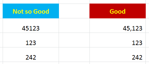
Right align for numbers
This is a bit basic, but something to watch for. If you just center the numbers, it is impossible to see which numbers are actually bigger or smaller. Like your 4th grade teacher said, “line up your ones, tens, and hundred columns”. Yes, I know the bankers, CPAs, and finance folks are laughing.

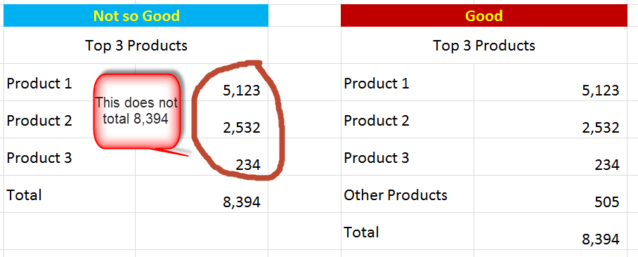
Tables have to total
Once again, to finance folks this might be insulting. If you have a table of the top 10 or top 15 of anything. . . . you still need to make sure it totals. I often put in a “plug”. . . count up the remaining products and put in the total. = 8,394 – 5,123 – 2,532 – 234 = 505. Whatever you put in a table, should total. Basics.

Order things
Whether it is alphabetical or in descending order, have a reason for the order of your items. Remember consultants are the kings and queens of structure.

No twerked words
Okay, now we might be getting into preference. For me, I think it’s unnatural to write words sideways. It’s unnecessary, and awkward.

These are not deadly sins
These are somewhat cosmetic problems. They are not mathematical errors which would get your fired from a banking internship. Yet, they do show a lack of rigor, attention to detail, and verve. If you want to stand out, take the excel to the final 10% and make it easily understood.
What are some of your excel formatting nit-picks?
From Kirk (see comments):
- Spell check. “No excel doesn’t give you a handy little squiggly red line with things are wrong, but it’s not hard to hit F7 before you save something.”
- Grid lines. “Turn them off, makes your workbooks look unfinished. Alt-W-V-G FTW.”
- Worksheet Names. “Do not send me a workbook with anything named “Sheet 1”, or a blank “Sheet 2” and “Sheet 3” sitting there. Be intentional.”
From Simone (see comments):
- Currency $. “It’s ambiguous whereas USD / CAD / HKD are not”
- Date formats. “With D-M-Y / M-D-YY / Y-D-M vary around the world, why not always specify DD-MMM-YY so your international audience are not confused”
From Paul (see comments):
- Restrained colors. Recommends 1 day course by famous Edward Tufte here.
From Lalatendu (see comments)
- Freeze frames. readability increases (irritation while scrolling decreases!)
- Repeat row or colum. For print/ page set up, repeat the row or column as required, else it does not appear in next page
- Use “If error” formula. for any calculation tab to avoid #NA across the cells
- Send with PDF version. While sending across the excel in email – also send a PDF version as some viewers might access it through their mobile devices.
- Format consistency. In case of numbers, maintain the same number of decimal points (and right aligned – as mentioned in the post)
From Martin (see comments)
- Page set up: Take care of page setup, nothing worse than going to print and getting something strewn sideways and vertically across 16 pages

Could go for days here, but a few that always drive me crazy with new analysts:
– Spell Check. Not really a formatting issue, but still shows lack of attention to detail. No excel doesn’t give you a handy little squiggly red line with things are wrong, but it’s not hard to hit F7 before you save something.
– Grid lines. Turn them off, makes your workbooks look unfinished. Alt-W-V-G FTW.
– Worksheet Names. Do not send me a workbook with anything named “Sheet 1”, or a blank “Sheet 2” and “Sheet 3” sitting there. Be intentional about the information you include and how it’s organized.
Adding all these to the post. Thanks.
This is a personal preference, but I hate how Excel defaults to a bottom of the cell for vertical alignment. It makes reading across cells with multiple lines of text difficult. Change to top aligned or go with the center vertical alignment, like in your last example with the word “Products.”
Agreed. Oh Excel.
Date formats – with D-M-Y / M-D-YY / Y-D-M vary around the world, why not always specify DD-MMM-YY so your international audience are not confused.
And with currency $ is ambiguous whereas USD / CAD / HKD are not.
Simon
27-Oct-15
For the love of Peter, please don’t get carried away with font changes and use of colors! Be judicious! See Tufte. By the way for anyone who hasn’t, get yourself to one of Edward Tufte’s one day courses. I think for less than $400, you get all four of his books plus the man himself. You will come away smarter and armed with techniques you will employ immediately.
Take care of page setup, nothing worse than going to print and getting something strewn sideways and vertically across 16 pages
OMG. Completely agree. Total rookie move (which sadly, still happens to me sometimes). Good one. Will add into post.
In addition to the above –
1. In case of large data sheets spanning across multiple pages –
– Always do freeze frames – readability increases (irritation while scrolling decreases!)
– For print/ page set up – repeat the row or column as required, else it does not appear in next page
2. While adding the total row either at the top or bottom – use judgement and do not simple drag the sum/ subtotal formula (nothing like seeing the sum of Employee IDs)
3. Use “If error” formula for any calculation tab to avoid #NA across the cells
4. While sending across the excel in email – also send a PDF version as some viewers might access it through their mobile devices
5. In case of numbers, maintain the same number of decimal points (and right aligned – as mentioned in the post)
Winning. Winning. Winning.
This was implied in the example under “right align for numbers”, but not explicitly addressed: I go nuts when I see large numbers displayed with “General” [read: zero] formatting. In the name of all that’s holy, people, use Number formatting—with the comma separator—for ALL numbers, but especially for those greater than 999. If the centering of numbers makes it impossible to distinguish big from small, showing them as formless pukes of digits makes it impossible to comprehend their value.
Another one that kills me is the amalgam of hideous aesthetic and chart junk that’s indigenous to Excel Charts, which tends to make any data viz look quite unprofessional. You’re better off taking some very strong cues from Edward Tufte, and using those to build yourself a set of custom chart templates.
Amen.