McKinsey & Company do great work.
On this blog, I have written about McKinsey’s leader, culture, high-visibility assignments at the CIA, and Department of Corrections. Overall, have enormous respect for the work they do, and the way they have built their practice. So, now I would like to take a look a their presentation structure and format. Let’s dissect a McKinsey presentation.
Key elements of a McKinsey presentation?
I was curious how good their presentations are. I have physically seen a dozen or so from clients who had McKinsey-ites passing through their halls. Online, this content is pretty easy to find. Some of them are from industry conferences and others are from client engagements that their clients (oddly) leave online. Others are public record, like this one.
I reviewed a 39 pg presentation from 2010 by McKinsey for the USPS here. Generally, this deck follows a simple, but strong logic. It addresses a HUGE problem facing the US Postal Service and provides a smart roadmap.
1) Stay Organized
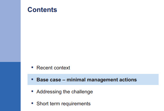
It’s common for consulting presentations to have table of content pages which is re-introduced at the front of each section – telling the audience where in the flow of the presentation they are. These are road markers. In the example below, this introduces the base case section, part 2 of 4.

2) Parallel structure in titles
I remind my teams that the titles of the pages are the most valuable real estate – use them wisely. Its storytelling, so the titles should come together cohesively. The titles should read well – similar structure, tense, tone, format. Like an essay, the points should be clear with transitions between the arguments.
3) Credibility through data and documentation
Consultants are known for their left-brain, data-crunching rigor. McKinsey is no different. Unless it is a straight marketing or organizational design piece, there are numbers on the majority of pages. They will create data through surveys or other means, if necessary. Clear footnotes indicate where the data comes from . . even if it coyly says “McKinsey Research”.
4) Make sure each page has a point
Senior managers are trained to push consultants to answer the question “So What” for each page. Each page needs to say something clearly to the audience, or it needs to be taken out. In this page, you see there is a kicker box which says 55% of the reduction came from overtime and non-career cuts.
5) Create a simple framework for the problem
Consultants solve complex problems with lots of moving parts. As a result, it’s important that we bucket the ideas and details into an overarching structure which is easy to grasp and helps with the storytelling. Often this can be done with a simple income statement (Rev-Cost=Profits) or balance sheet (A = L+E). Here the reader sees from the color coding that there are several unfavorable revenue AND cost trends.
6) Find the right data
In professional services, it’s all about the client success – not ours. Therefore, you do what it takes to get the answers and (try to) bury your pride. In the following page, you see that McKinsey actually refers to BCG research on the topic; acknowledging their competitors’ work when appropriate.
7) Charts which are easy to understand
McKinsey slides tend to be busier than I prefer, but their charts are at least simple and easy to understand. You see that they are clearly labeled and the trend lines are obvious. Revenue is flat. Costs are going up. Profits are going down. Cumulative losses are going up. Unequivocal. Direct.
8) A clear case for change
Too many recommendations – including the strategic ones by McKinsey – end up on the executives shelves collecting dust. It is almost a joke. As a result, it’s key to make it in-your-face clear why action is needed. McKinsey shows that $18 billion can be saved if these actions are taken, or $123 billion total. Billion with a B.
9) High level recommendations have details
In true Minto Pyramid fashion, there are back-up pages for the recommendations with specific action steps. Here the $10 billion in savings is broken into 4 initiatives and a few action steps:
Question – not sure how the argument on the right hand side supports this $10 billion target. McKinsey notes that the USPS already automates 90%+ of its processing, thereby questioning the feasibility of really improving that much. As a reader – my question is. . .is it possible or not?
10) Go beyond the obvious
Here comes the creativity. Yes, consultants do a great job of capturing internal know-how, structuring it in a smart story, and marrying it with best practices. That puts a consultant’s performance at a B-/B. Good, but not great.
The real “juice” in consulting comes from thoughtful inquiry, rigorous intellectual curiosity, creativity, and something new. Let’s remember. . . our clients are smart too. They don’t need you to just regurgitate what everyone knows.
Here, you see McKinsey proposing 30 new revenue streams for the USPS to consider, and the methodology to filter out the ones which are not profitable, or not controllable.
5 Consulting Courses
Available on Coursera
Yes, I’ve spent months in the studio, recording 5 courses for Coursera.
I’d like to share my experiences and advice on how we can all work like consultants; smarter and faster.
You can audit the classes for free, or pay to get the full experience and certification.
Click any of the buttons.
