Consultants see patterns
It’s a core part of our job to analyze data, separate the signal from the noise, and interpret the patterns. Some are better than others and it’s a talent that takes time to turn into a skill. Find good presentations and study them. Like an craftsman who can appreciates solid work, geek out on graphs and analyses. Start collecting good presentations, learn how to storyboard, and learn how to tell stories.
Study graphs, charts, tables
Getting good at graphs takes more than the technical (how to) of manipulating excel and Tableau. You need to know which template makes the most sense for your argument (pie chart, table, line chart, bubble graph, waterfall).
Read the Economist
I have been a long-time subscriber of the Economist for 20+ years. It’s a must read and listen. Do yourself a favor and subscribe to the Economist podcast for free. You can also access 5-10 articles for free every month, including the blog called Graphic Detail. Some of the examples below. My commentary about good / bad graph behavior will be in red font.
1) Older Nobel Prize winners
The article here discusses how the age of Nobel Prize winners keeps increasing over time (with the exception of the Peace Prize). They make the smart observation that lots of scientific discoveries are experimental (not theoretical) and therefore the committee waits years to gauge the lasting impact before awarding the prize. They also wryly note that it could be more age-weighted (giving more prizes to the elderly) as those people have less time and no prizes are given posthumously.
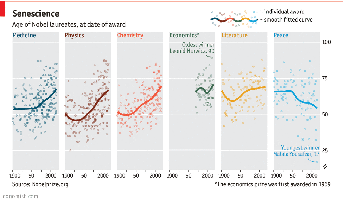 Scatterplots are not my favorite. Too often it is the consultant showing the client that “we used a lot of data, you should trust us.” It is a visual way to show show the min/max and distribution. Thankfully, the Economist added a trendline which definitely highlights the larger point of the article – prize winners are old, getting older. Also, like how the Y and X axis are the same – so there is a common reference point. Also, they pointed out the oldest (90) and youngest (17) winners.
Scatterplots are more visual than informative. For example, the article notes the following (none of which is obvious from the picture):
- “No one under the age of 50 has ever been awarded the economics prize.”
- “A mere nine of the 112 literature winners have been younger than 50.”
- “Since 2000, only 8% of the award-winners in chemistry, physics and medicine were under 50, compared with 36% of those who won the prizes in the last century.”
2) Drop in US Crime
The Economist shows very clearly that the rate and total number of violent crimes, murders, and property crime have fallen over the last 35 years. As a clear example, the number of murders in New York City in 1990 was 2,245. Last year it was 352.
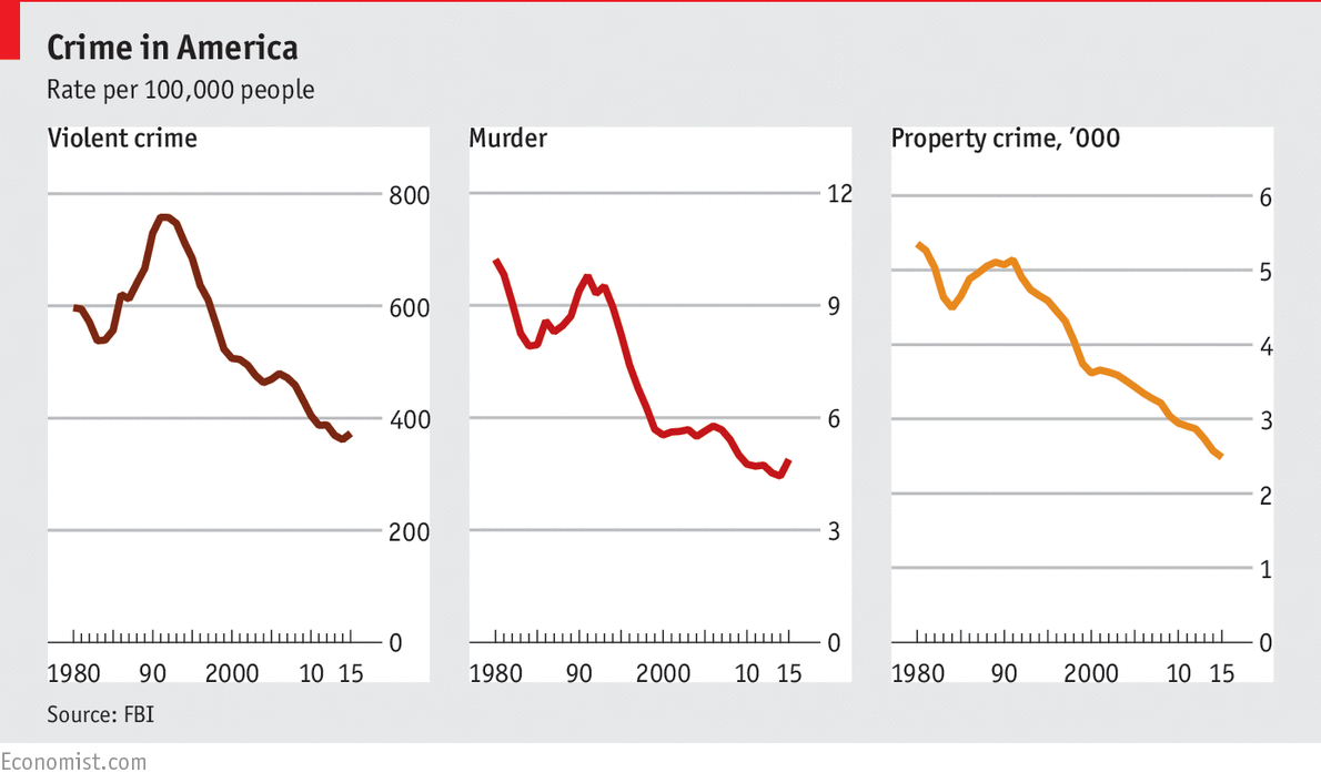 Line graphs are the best. They are simple and clear. I prefer graphs which you can read from 3 feet away. “Oh, crime is down.” BOOM. That is how clear and potent you want your messages to be. Note that they made it rate per ,000. So that the violent crime rate on the left graph is 370+ per 100,000. . . instead of 0.371% (which is hard to really visualize).
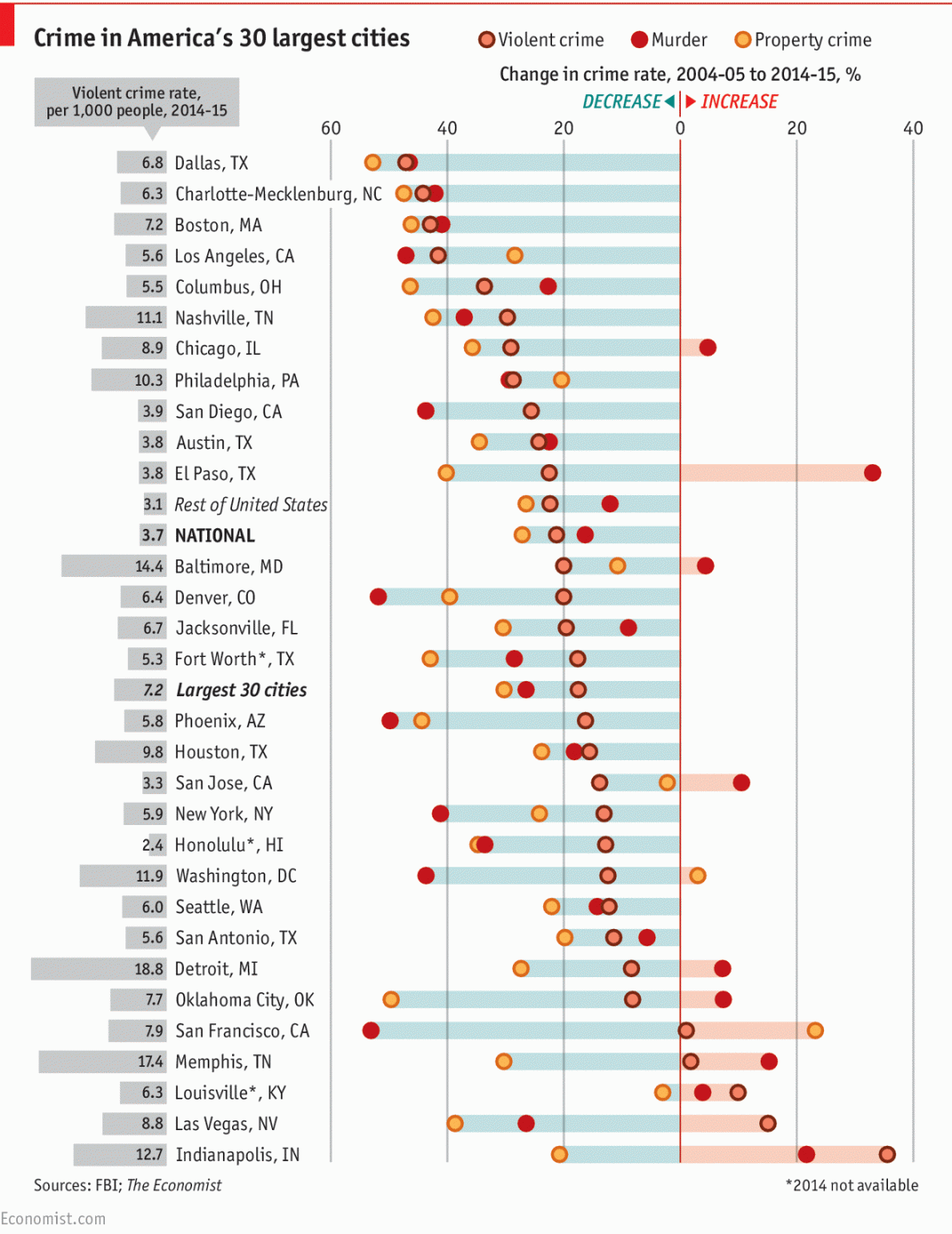 Careful with data buffet graphs. This graph is WAY busy. It shows several data elements, which in a presentation, you would probably break this into 4-5 different pages. Presented together, it’s useful to reference but does not tell 1 story. It tells many stories.
This is like a buffet – you can sit there are choose what you want. It’s not particularly curated and it is meant to appease different tastes. It’s a little luke warm and easy. Yes, there is a little bit of ranking by least violent crime city (Dallas) to most violent crime city (Indianapolis). Yes, they put the national average in the middle to know if you city was “above the line” or “below the line”. No, it’s not a compelling graph. It’s informative and probably something you put in the back-up pages.
A smart consultant would take the crime stats by city . . and try to drive correlation and insights (correlated to geography, economic growth, immigration, industry mix etc). Data buffet graphs tend to get the dreaded client response, “So What?”
3) More craft breweries in non-religious states
Yes, this seems almost obvious, right? So too are many consulting recommendations. Sometimes, the data simplify confirms what you were thinking and gives you the magnitude. In the Economist study here, shows that the # of craft breweries per 100,000 people is largely inversely correlated with the level of self-professed religiosity.
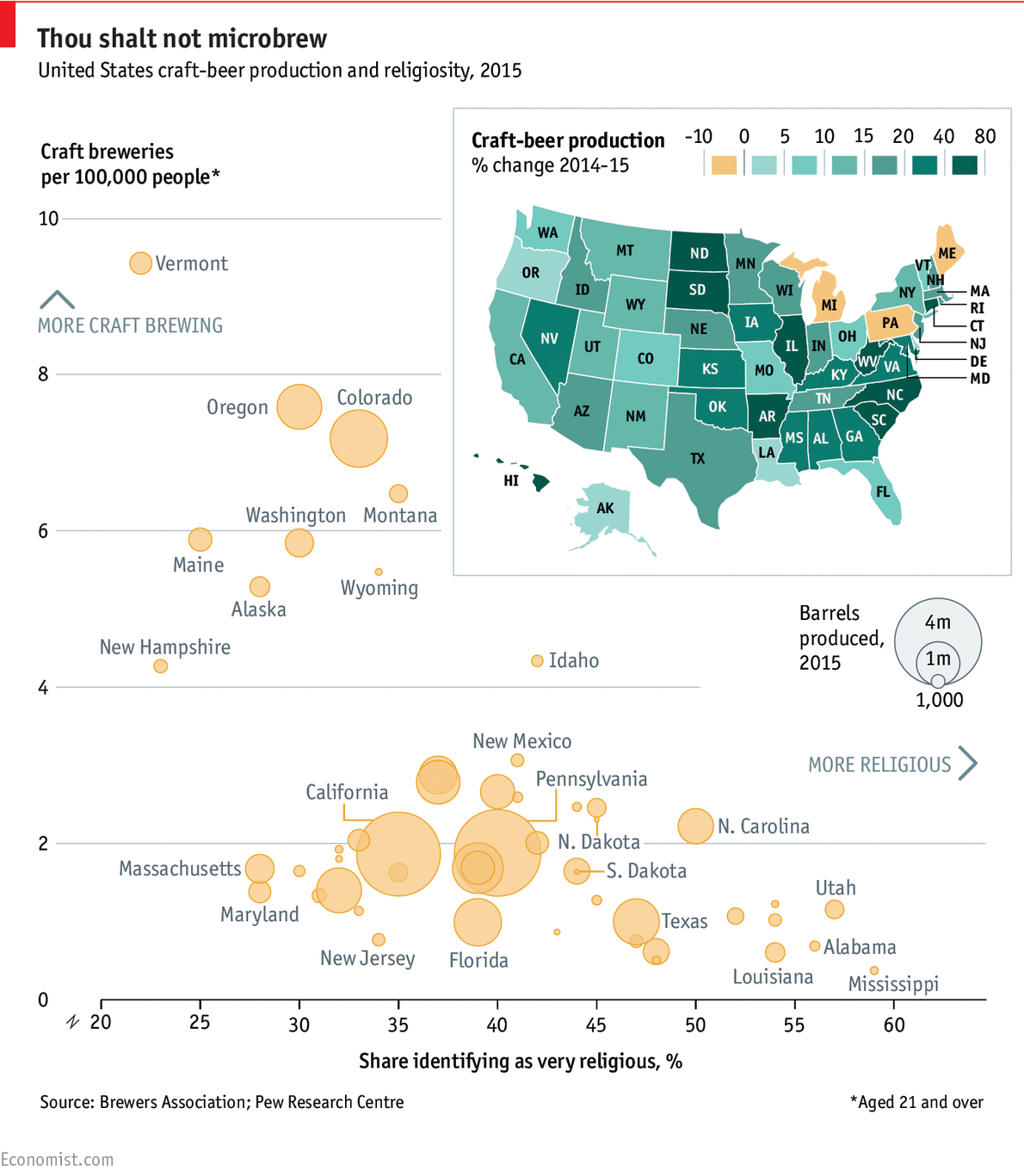 Bubble charts are fun. They take the standard plot graphs (X and Y axis) and add 1 more dimension (the size of the bubble). Sometimes this can be too much information, but in this case – I think the bubble size is informative.
- On the Y axis (breweries per capita), Vermont is very high, but honestly, that is a pretty small state and small beer production – look how small the bubble is.
- On the X axis (level of religiosity), New Jersey and Alabama are both small bubbles (low beer production), even though NJ is a lot less religious and 2x the population.
- Funny – there is such an inverse correlation between X and Y, that they put an entirely different US state map in the top right. (I assume there is nothing behind it).
4) Global shipping falling profitability
The Economist notes here that there is a perfect storm of excessive shipping capacity (too many ships), and falling demand. As a result, prices for the Baltic Dry Index has fallen 95% since the high of 2008. Container lines will lose $10 billion this year, and Hanjin – the 7th largest liner – filed for bankruptcy. Lots of announcements of “alliances” which are show in the graph below. My guess this is just the start of a massive M&A which will take 10-15 years to play out. One of my favorite strategy books is The Rule of Three (affiliate link) which says this industry is definitely headed towards consolidation.
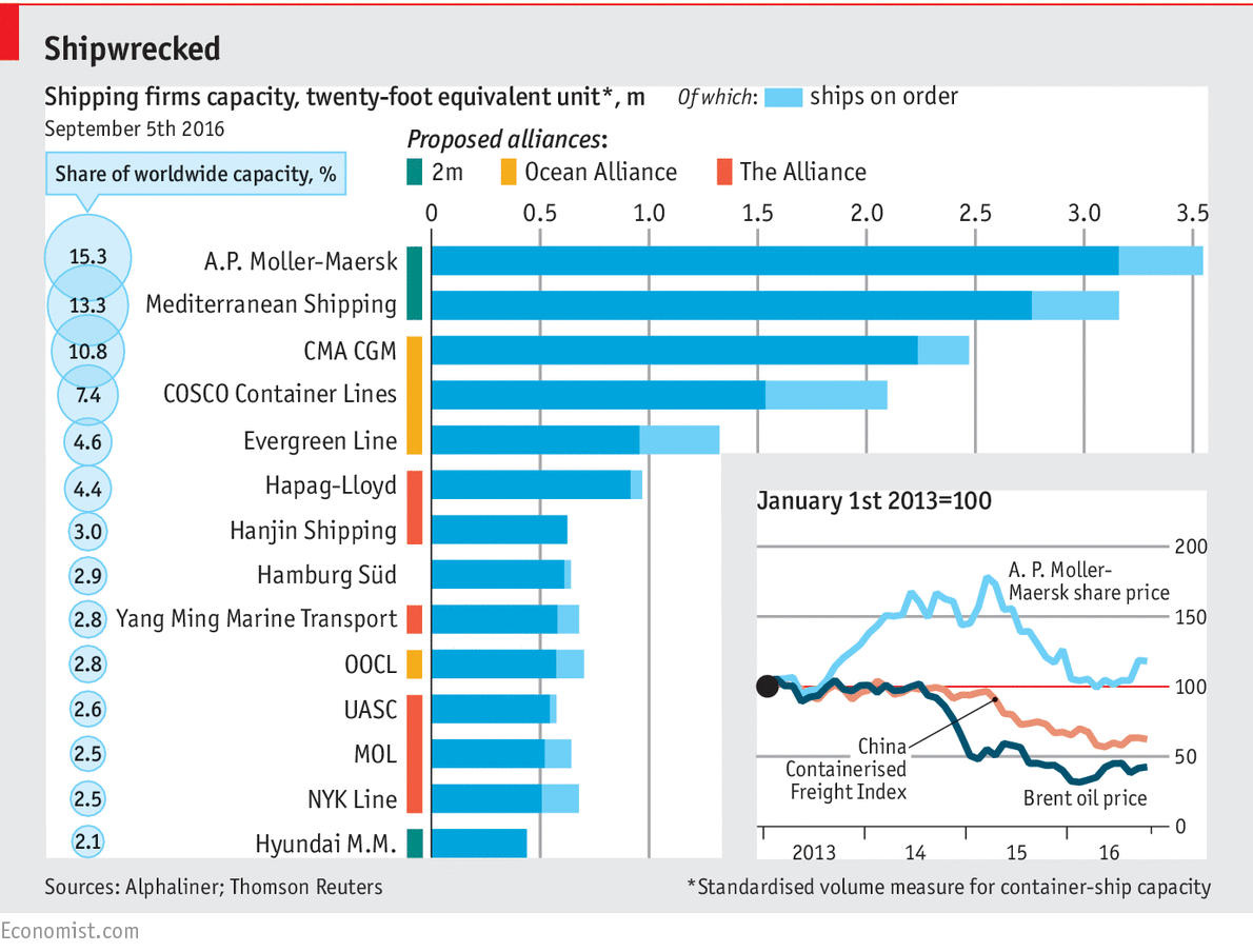 The graph should support the story. The graph is fine. It is a bit of a data buffet – lots of data without a strong point, but 0-k. My feedback / criticism is that the article here talks more about supply, demand, and profitability – not a lot about alliances. It’s one of those situations (very common in the life of consultants), where what is one the slide is not the narrative we are presenting. Alternatively, if alliances and M&A were the big story – then the words in the article should support that line of persuasion.
5) Now it is your turn
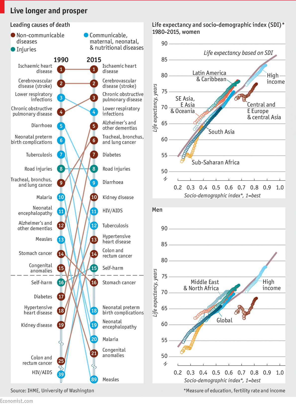
What can you take away from this graph and article here? I am a huge fan of the Economist, but these data buffet graphs are not always that effective. What is your point of view? Feel free to post in comments.

Really nice blog. The charts/tables/graphs are such useful to presentation that help to discover what exactly you want to show. And it needs the deep study to understand charts/graphs. We can used it for our Reporting to our clients about to show there business growth. Thanks to share such helpful info.
Agreed – it is most difficult to say complex things simply.