This is the second section review of Duarte’s Slideology (affiliate link). This agency has become a sensation after they did Al Gore’s Inconvenient Truth presentation and also a famous TED talk here.
Chapter 2 – Create ideas, not slides
I will largely skip this chapter as the idea of brainstorming, understanding the WHY, sketching out the storyline, and getting feedback are not new concepts for readers of this blog. The main points of this chapter:
Simplicity is the essence of clear communication. – Duarte
The best place to start is not the computer. A pencil and a sheet of paper will do nicely. – Duarte
Chapter 3 – Create diagrams
If you agree with Duarte’s argument that page-after-page of bullet points and text are a bad idea (as I do), then you need thoughtful diagrams to show relationships between things and move the story along.
Diagrams (or frameworks) provide scaffolding for the story. What comes first? What comes last? Is there some correlation or causality? While you don’t want to be to be so heavy-handed that the audience feels you are going through an outline, you do want some organization. If not, the audience may feel like you are giving them a box of Trivia Pursuit facts. It’s can be disorienting and painful.
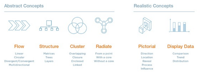
On Duarte’s website here, they show 4,000+ different diagrams, but they are largely bucketed into 6 main categories or archetypes. Consultants will find this all very familiar territory because we do this everyday; we put things in buckets, prioritize them, and making the complex simple. See some examples of each of the types below and my personal (arguably conservative) view on them. There are many more versions of these diagrams, but please find some basic interpretations below.
3-1. Flow – Linear
You see one of these in EVERY proposal and EVERY project kick-off presentation. It explains the different phases and what will happen when. This also scopes the project, so the client does not expect #3 activities at the beginning. This has the added benefit of reminding the client on where you are in the process.

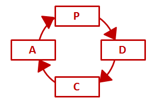
3-2. Flow – Circular
Also very common in any lean/six sigma presentation. Continuous improvement never ends (ergo – a circle). PDSA. PDCA. DMAIC. For sustainable change, it’s a never-ending process. Sounds tiring, eh?
3-3. Flow – Divergent / Convergent
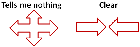
These can be a bit heavy-handed if you are not careful. In the book, Duarte shows several “diverging” diagrams that look like the 4-way stop sign below. It tells me nothing. It whines, “Lots going on. . .can’t explain it.” Honestly, if a path breaks into 2-3 options – no need for nuanced graphics – just list them out. In contrast, the diagram on the right is super simple. Two forces are opposing each other. Got it.
3-4. Flow – Multi-directional
Okay, some of these examples in the book are too germane. . .arrows and boxes pointing in different direction. Gives a sense of chaos. No fancy graphic needed to show complexity. After all, the client already knows its complicated and multi-factorial – that’s why they hired a consultant. No need to state the obvious with more PowerPoint.
However, this is also where Duarte categories process flow maps – which probably deserve as chapter entirely to itself. These are bread-and-butter consulting tools. Over the course of a career, you will make hundreds of these on PowerPoint and Visio.

3-5. Structure – Matrices
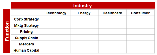
In normal person parlance, these are tables. Simple grids with something at the top, and something on the left. Easy to read, easy to understand. Useful tables. As a mentor reminded me, “we don’t use tables enough.”
3-6. Structure – Trees
Duarte describes these as frameworks which show relationships between people or ideas. For me, these come in two major flavors:
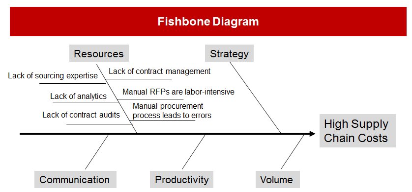
Root Cause diagrams
These are also called “Ishikawa” diagrams or fishbone diagrams because they look like a fish skeleton. They are a common way to show the groupings. As you can see below, there might be 50+ reasons for high supply chain costs, but this method forces you to group similar issues and elevate the major causes into the “ribs” of the fishbone (e.g., resources, strategy, communication, etc). Some examples:
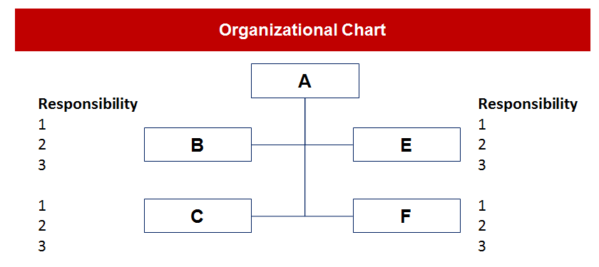
Organization chart
We’ve all seen this in our corporate lives. We all know what this looks like. . .
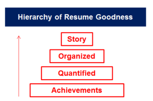
3-7. Structure – Layers
Duarte describes these as diagrams which show hierarchy or progression, which I use most often in maturity models. You can see a very unscientific, yet practical structure I put together on what a good resume looks like. . . starts with the basic achievements, but should also be quantified, organized, and hopefully, a good story.
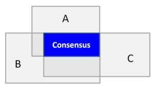
3-8. Cluster – Overlapping, Closure, Enclosed, Linked
This will be brief because I found the 48 examples she gave in this section to bear a goofy resemblance to clip art and not very insightful. Think of these as multiple version of a typical Venn Diagram where you are mixing, matching, grouping, sets of smaller items. Jessica Hagy has some really funny ones here.
3-9. Abstract – Radiate from a point, with a core, without a core.
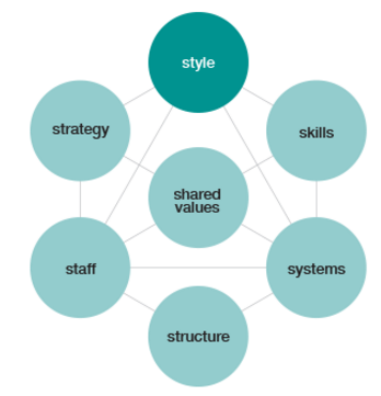
These vary from a yin/yang symbol, to a sunflower, to a pentagon. They shows relationships one-to-may, or many-to-many. The famous McKinsey 7S is one example. In the end, it provides a nice template from which consultants can analyze complex problems with multiple, interdependent factors. You will often see these on proposals where the adviser does not know the specific problem yet, but wants to give an idea of where they might look.
3-10. Realistic Concepts – Pictorial
The 36 examples given in the book look a lot like clip art. Don’t use clip art.
3-11. Realistic Concepts – Displaying Data – Comparison
Okay, this is getting into bread-and-butter consulting here. Finding smart ways to analyze data, then represent it in compelling ways to motivate change . . is what we do. Some key questions to address:
- When to use a bar chart instead of a histogram?
- When to use a stacked chart?
- How to best label an axis?
- What does a misleading chart look like?
- When to use a pie chart?
3-12. Realistic Concepts – Displaying Data – Trends
As a consultant – lots of important considerations when showing trends:
- What is the time frame of the data?
- What is the sample size (n=)?
- What should be emphasized with color or call out?
- If I show an “average” do I show median, mean, or mode?
3-13. Realistic Concepts – Displaying Data – Distribution
For the engineers out there, I don’t need to recount all of them to you, but to name a few: scatterplots, spider charts, histograms. A great way to get smart on charts and graphs is simply reading the Economist.
Chapter 4: Displaying Data
Everything she wrote in this chapter does not need paraphrasing. . .it is excellent in its quotable form. All words in blue from the author:
When it comes to displaying data in your presentation, you must adhere to one principle above all others: clarity.
Data slides are not about the data. They are about the meaning of the data.
Use the following 5 principles to present your data in the clearest possible way: 1) Tell the truth 2) Get to the point 3) Pick the right tool for the job 4) Highlight what’s important 5) Keep it simple.

