What’s a Venn diagram?
Yes, you’ve seen these overlapping circles before. It’s a simple and visual way to show different data sets. What is separate and what overlaps? Consultants and executives love diagrams, right?
I Used to not like them
For the longest time, I did not like them. They seemed too conceptual – goofy, unspecific, and “soft”. The kind of cheesy thing you would find in a presentation that means nothing.
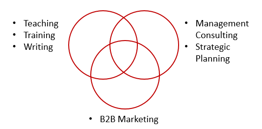
Then this week, I either mentioned, or drew them 5 times in 2 days. When explaining my professional background, experience, and passion to students, Venn diagrams kept coming up. It was the easiest way to say it. After 20+ years in the corporate world, mine looks like this.

Venn diagrams are useful
Of course they are not specific or prescriptive, but that’s the point:
- Stays broad enough to not “box you in”
- Emphasize the intersection of many, often diverse things
- Forces you to choose 3-4 areas maximum
- Shows your ability to simplify, and “bucket” concepts
- Opens the interpretation to the listener (“what’s B2B marketing?”)
- Allows the audience a quick landscape view, before they ask specifics
What is your Venn diagram
- What is your Venn diagram, (skills, interests, and experience?)
- What is your client organization’s Venn diagram?
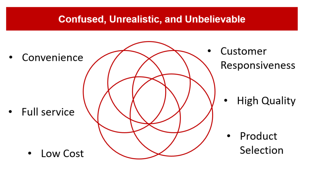
If you took a company’s strategic plan and drew it on a piece of paper, I fear too many of them would look like this. A spaghetti mess of platitudes.

If strategy is about making choices, make choices
You cannot be all things to all people. Not enough time, money, or employee passion for everything. It’s both unrealistic and unbelievable. What if we could only have 3-4 focus areas? It would force us all to make decisions, and clarify our strategic positioning.
For those looking to pivot to a new career. . .
asdf

Microsoft has a venn diagram displayed on their campus; the three circles are:
-what you are good at
-what adds value
-what the world needs.
The intersection is your purpose. I may have messed up the wording a bit…but I think the concept is helpful for anyone to think through.
Very cool. Thanks for sharing that. Also, I believe Jim Collins from the GOOD TO GREAT fame (BHAG, Hedgehog, Level 5 Leader) also used them. Will have to add that to the post – thanks. http://www.jimcollins.com/concepts/the-hedgehog-concept.html
Great Read.
Thank you John and Anonymous :). MS Diagram is also pretty cool.
Thanks for reading.