Who doesn’t love the Olympics? It’s a chance to see the world’s best compete in a safe environment, free from politicians’ rhetoric and jingoism. It’s inspiring to hear athletes’ stories. It’s good to refresh yourself on all those country flags that we learned in 7th grade, then summarily forgot. Oh, and the medals. Don’t we love to count medals?
Medal counts. As a consultant, it makes me cringe – just a little – when news commentators count up medal and rank countries. Shouldn’t we be normalizing results by the size of the country’s economy, population, or at least, but the size of the team they brought?
There are dozens or ways to count medals, but here are the four that make the most sense to me:
- Who won the most medals?
- Who won the most medals in relation to their economy?
- Who won the most medals in relation to their population size?
- Who won the most medals in relation to their team size?
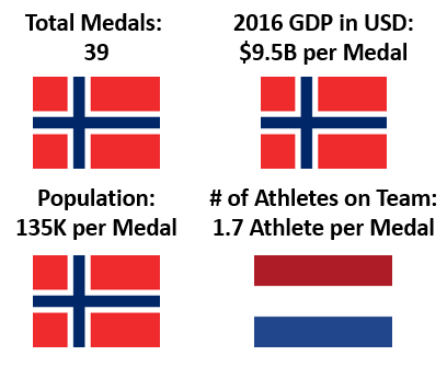
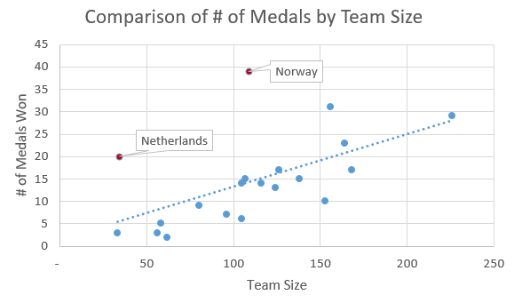
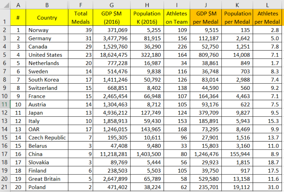
 Norway. They were clearly the “winner” in number of medals (39) and tied Germany for the number of golds (14). Norway has a GDP of $371 billion (United Nations data, 2016) which is much smaller than the economy of the State of Georgia where I live. Norway has a population of 5.2 million people, which is smaller that the population of Atlanta, Georgia. Yes, Norway won 39 medals with a small economy, small population. However, their team had 109 athletes.
The Netherlands had one of the smallest teams of 34 athletes, and yet, they won 20 medals. Doing the simple public math, it took 1.7 athletes to win a medal. Using that level of “productivity” the Canadians would have to win 132 medals with it’s large team of 226.

So what?
- Think in terms of inputs and outputs. In retrospect, it’s silly for the news to simply count up the medal totals without considering the size of the teams. Does it makes sense to compare Canada’s team of 226 athletes vs. Netherland’s 34? Of course not.
- Stay curious and wonder out-loud what other factors might play into the productivity of countries and athletes.
- Find data and put it in excel. One data point I looked for online, but could not conveniently find was the total number of medals awarded. If the top 20 teams took 292 medals. What % of total is that? How did the other 72 teams fare?
- Make apples-to-apples comparisons. It’s a bit silly to just count the total number of medals. When benchmarking or doing any other kind of comparison, normalize as much as possible.
- What does this trend look like? A more rigorous researcher (uh, not someone blogging before Sunday dinner), would look at the trend of medals by country and team size over time. The trend is your friend.
The spreadsheet with the data I was using. As is true of most data collection, it was a bit painful. Got GDP and Population from the United Nations website. The medal count and # of athletes I got from the Olympics website. A few caveats: 1) The number of athletes is not a perfect proxy for the number of athletes that competed for the team. Namely, someone like Michael Phelps (US swimmer) seems to compete in every version of the swimming competition during the summer games. 2) Just because the athletes are listed on the website does not mean they competed (sick etc) 3) I hand-counted the athletes, so that’s not fool-proof. Good fun.
Separately, look at the size of the economies. US $18 Trillion, China $11 Trillion, everyone else is small by comparison.

Related posts:

Very good blog post, always interesting with data analysis and sports.
An interesting dimension that should be added to the analysis is probably in what sports the medals where won. For example all of Netherlands medals from the last 5+ Olympics have come from basically the same sport (speed skating) that they completely dominates. I think this mostly explains why they get so many medals on such a small team.
Completely agree. Great point. Also, when I looked at the number of medals over time. . .I saw that the number of medals awarded (summer) went from 600 (1970) to 951 (2008). Thanks for reading.