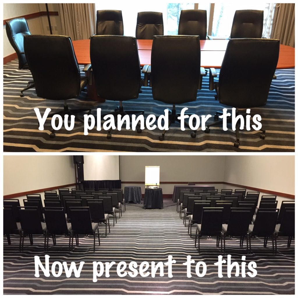
In the corporate world, most presentations are to small groups. In fact, the most common format is actually with 1 person in his/her office. The slides typically have more details (think: 18-22 font arial) and should be completely self-explanatory. They are skimmable executive memos on PowerPoint in Landscape orientation with clear tables, graphics and story line. Rarely present to large groups. . . until, surprise.
What happens when you suddenly realize that you will be presenting to a much larger room in the bottom photo? Unfortunately, you fear (rightly so) that your slides will not be visible from the 5th row.

Option #1: Trim down your slides (2-3 hours of work)
As tedious as this sounds, it’s best to edit the existing presentation (make version B) to suit the room:
- Enlarge the font titles and bullets; simplify the words and syntax
- Use tables with clear numbers; graphs with stark contrast in color (grey & red)
- Reduce the number of pages; need to repeat and illustrate (provide examples) for large audiences
- Think flexibility; slides should be a platform so you can swing the message; don’t get anchored
- Make the logic tight; it’s easier to lose 30 people than 3 people
- Simplify; reading slides is painful for you and the audience
- Use kicker boxes to call out your main points
Option #2: Change your titles (20min of work); enlarge tables/graphics
With less than an hour, make your titles font size large enough so it can be read. Use titles effectively so they are actually saying something. Don’t just put the topic (“Analysis” or “Interviews” or “Data”), that’s really not helpful, interesting, or progressive. Titles should say something, answer the question, “So What?”
I tell students, “If your PowerPoint is New York, then your titles are Manhattan.” Super valuable real estate.
Focus on a few key pages that have a diagram, prioritization, or something that shows your point of view. Don’t be boring, so think about what your “money slide” will be. What is the 1 slide that they will remember 5 years from now? Double down on your main point. What is the one thing?
Always: Tell the story
The best presentation requires no PowerPoint. Tell stories. Grab the audience’s attention. Be likable, be yourself. Enumerate your points #1, #2, #3. Walk around the audience and use the space. Pause for effect. Speak 20% louder than you think you have to. Animate – use your arms, and expressions. Importantly, have fun.
Related posts:
