A student recently asked me for clarity on prioritization slides. Yes, we’ve all seen these before. They usually come at the end of a performance improvement presentation with the intent of narrowing down the choices. Super useful, almost simplistic. That’s good (well, because simple is good) and bad. Bad because there’s often a lot of context, qualitative interpretation, and trust needed to do this well.

The simple and most literal response would be to create a framework, table, ranking system to compare different options. No different than comparing laptops on Best Buy’s website. And the real answer is that this varies enormously by firm, by senior manager, and by person(ality). Here is my take on it, n=1.
Do the Work
Long before we get to slide making, there are multiple ingredients that need to be right on:
- Asking the right questions, using creative ways to dig up data to analyze
- Considering the audience’s appetite for risk, timeframe, budget, and ambition
- Forming your own point of view (yes, that’s what they are paying you for), not just summary of facts
- Scaffolding the problem with hypotheses, logical structure, and chronological sequencing 1-2-3
- Circulating the ideas ahead of time. Nemawashi so the initiatives don’t die on arrival
Provide insight
So, yes, this presupposes that you are pretty far-down the thinking-food-chain. You are digging with your excel, in the right place. You are taking the data / information and refining it so that it is heading towards “insight”, an “ah ha” moment. You are creating value, right here.
- What is the 80/20 principle? What are the 20% of inputs driving 80% of the outputs?
- Is there a framework that helps you characterize the information?
- Can you point the client’s attention to something specific?
- What are the “buckets?” Revenue driver vs. cost driver? Long-term vs. short-term?
- What is the current trend, and what is the likely impact in the future (pro-forma analysis)?
- What is the necessary benefits needed to break-even within 24 months?
- What was the distribution of results? Why do you think that is true?
- What are the next set of analyses that need to be done?
- Why did you choose this particular analysis, among the hundreds of potential things you could have looked at?
- What’s the “So What?”
Make it easy to decide
Any consulting project kicks up a lot of interviews, discussions, ideas, and opportunities. However, you cannot feasibly recommend that the client do all of them now. That’s foolish. Therefore, what comes first, second, third, and “don’t bother”.
- What’s the one thing that definitely needs to be done? What will it take to finish it?
- What is the criteria you are using to determine the priority? Importance, in what way? Risk, in what way? Payoff. measured how? Resources required, what do you mean?
- Is this all subjective, or do you have some data to show what this will cost and how long it will take?
- Who’s input did you get to determine this? Subject-matter experts, published data, the client, your experience?
- If you had 15 potential initiatives, how are you going to visualize them?
- What are the assumptions? What would have to change, for you to change your sequencing?
- Should this reflect the client’s goals, risk tolerance, and ability to get it done? Yes, of course.
Don’t confuse
Too many companies try to do everything, and they are left with a bunch of half-finished projects, with a wake of exhausted employees. Time is the only resource you cannot buy. Be picky.
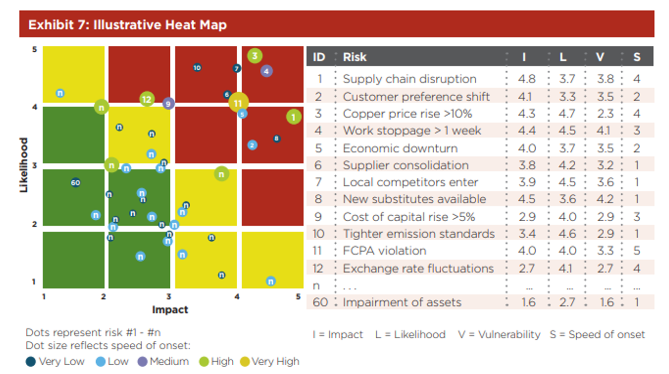
An example from Deloitte here. Is this one too busy? Yes, but you get the point. They took 60 different types of risks (crazy) and rated them with 4 different variables (Impact, likelihood, vulnerability, speed of onset), then mapped 2 of those variables with a X.Y plot. In terms of the colors – I would ignore those for now. Like I said, crazy.

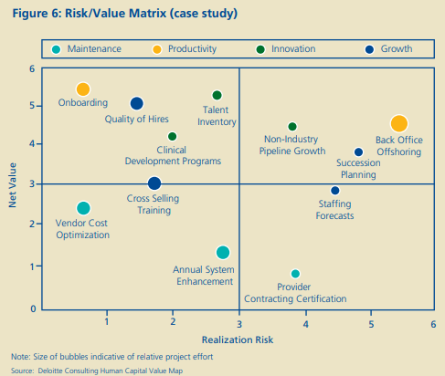
Another one from Deloitte, albeit, simpler. This shows a 2×2 matrix with the two scales being “net value” and “realization risk”. Unfortunately, both sound a bit vague and touchy-feely. You will have to read the report yourself to make sure that the green dot has the data to back these up. In other words, why is back office offshoring a 5.5 in realization (X axis), but a net value of a 4.2 (y-axis) which is the same as non-industry pipeline growth.

Give (enough) implementation detail
Ergo, let’s help the clients choose the right things (prioritization), and make it very doable (implementation). Think of this as a precursor to the next statement of work for “phase 2” of your project
- What are the major milestones and deliverables? Let’s work backwards from that date.
- Does the client need 1) MS-Project plan or 2) 30pg MS Word document with very specific checklists?
- How long will it take? Who is going to do the work? Clients or consultants?
- What are the dependencies and external factors (think SIPOC)?
- What kind of projects has the client had success with in the past?
- What does the governance structure look like? Who should sit on that group, and how often should they meet?
- What are the key assumptions of the plan, and potential risks? What can you do to mitigate them?
encourage
Change is hard. Often, without an external coach, conscience, instigator, helper, consigliere, things don’t get done. Internal consultants will tell you, “it’s hard to be a prophet in your own home town.” On a simpler level, why do you think that personal trainers even exist? Yes, good fitness advice is plentiful and yet, we need that coaching. Let’s get those clients to the metaphorical gym.
Related posts:

Great and precise description. And unfortunately extremly true. Really sad that even top notch companies have areas and departments without any prioritization processes at all.
So true, so true.
precise or accurate?
Good Stuff and to the point
Thanks for reading.