Data visualization sounds fancy, but it basically means charts and graphs. Consultants are good at quickly breaking down problems and telling stories with data. Graphs can be succinct: yes, “a picture tells a thousand words.”
Lots of research has been done on this topic and certainly best practices exist. Anything by Nancy Duarte, or Say it with Charts, Gene Zelazny (affiliate link) is a great place to start, but I have something even simpler.
Practice looking at lots of graphs and find things that you like, don’t like. In other words, try the food. See what tastes right to you; develop your own point of view. Some examples from the Economist and Wall Street Journal:
1. Keep it simple
- The biggest error with data visualization is clutter; trying to do too much
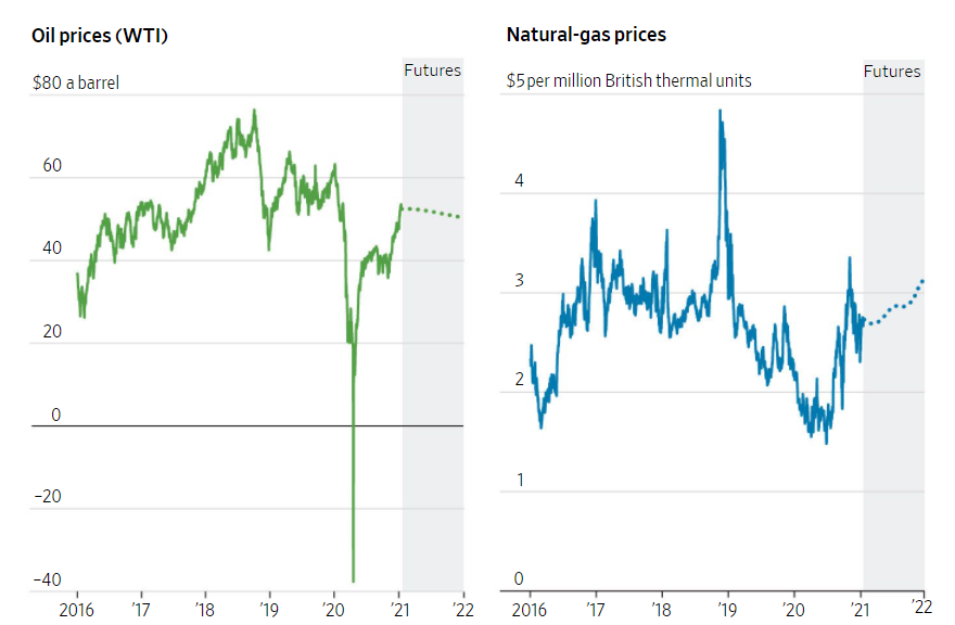
- Often, the best idea is to make two separate graphs, like below
- Here oil and natural gas prices trends are different enough to warrant two different graphs
- Oil-and-Gas Industry Faces a Slow Recovery From Pandemic Lows, WSJ, 1/17/2021
2. Show a trend, not a data point
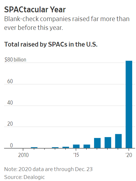
- If you have enough data, show the trend, it puts your arguments in context
- SPAC, new ways to raise funds (blank check companies) boomed in 2020 at $82B
- Yes, $82B is a lot of money . . .especially compared to $13B in 2019
- Startups Going Public Via SPACs Face Fewer Limits on Promoting Stock, WSJ, 1/3/2021
3. Tell a story
- This is the meta-advice for anything business + visual
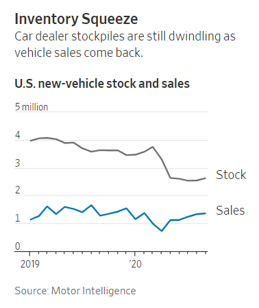
- Sometimes, it involves the relationships between two different factors
- Over the last 2 years, US car sales were steady, while inventory has dropped significantly
- Why You Might Have Trouble Getting the Refrigerator, Can of Paint or Car You Want, WSJ, 10/25/2020
4. Be consistent
- Yes, data and charts can lie and mislead. So, definitely use the same scale when comparing data
- Clearly Wikipedia’s future growth is in non-English languages
- Hindi looks like it is almost zero because it is on the same scale as English
- Also, be able to explain potential outliers. . .like. . . . Cebuano?
- Apparently, Cebuano is the #2 most spoken language in the Philippines with 20M speakers. Alarmingly 90%+ of the articles were written by bots. This is not an auspicious sign for the quality of all Wikipedia articles.
- Wikipedia’s future lies in poorer countries, Economist, 1/9/2021

5. Make the point obvious
- This is something we don’t do enough. Get to the point and make it obvious
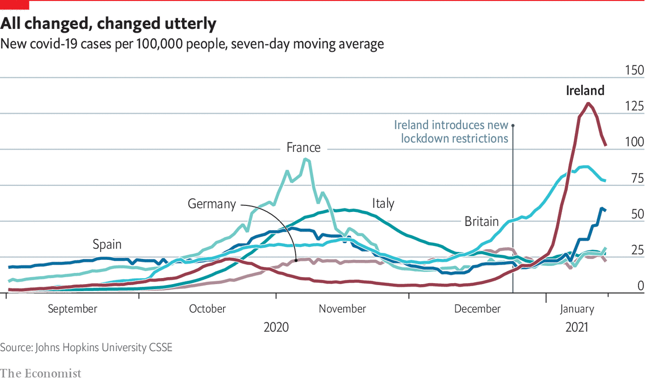
- This graph is a little busy, but Ireland is clearly the main point (highest peak, bolded name)
- Ireland has a rocket-launch spike in Covid-19 cases. Upon reading the article, it looks like Ireland relaxed social distancing restrictions to give people a “meaningful Christmas”. uh, not really
- Ireland has one of the world’s highest covid-19 infection rates, Economist,1/15/2021
6. Use colors deliberately
- It’s an amateur move to use more colors, for no reason
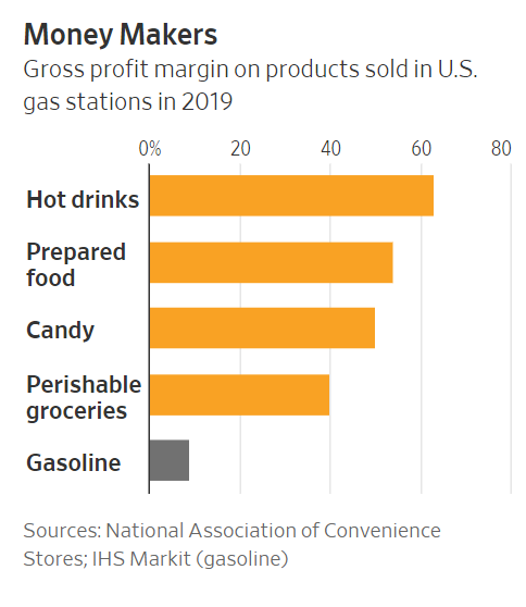
- Here you can see that gas stations make great margin on everything except gas
- Great margin products = orange, gas = grey
- Groceries Prove a Pandemic Bright Spot for BP and Shell, Economist, 1/16/2021
7. Say something
- Every slide or data visualization should say something
- If the graph doesn’t answer the question, “So What?” better to throw it away, or put in appendix
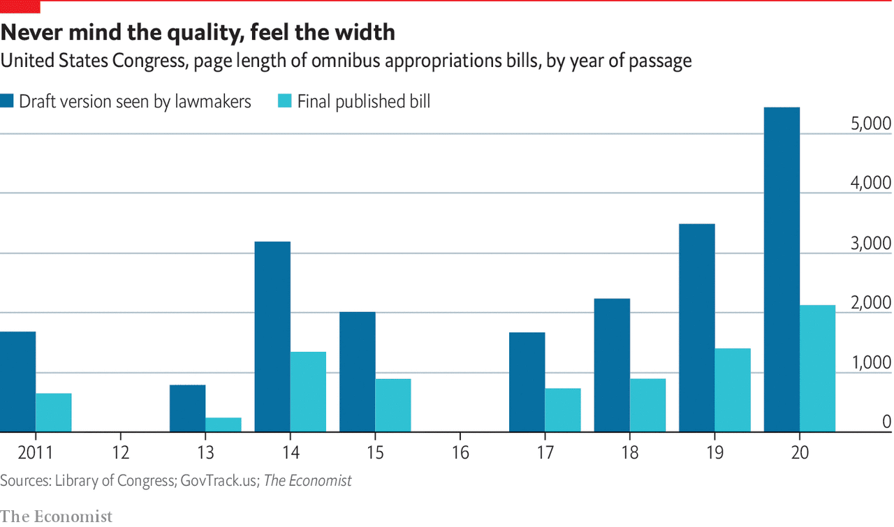
- The US government spending bills keep getting wordier; the 2020 final version was 2,000+ pages
- Apparently, it’s unreadable in the time allotted before voting. One senator recently called on both the Republic and Democratic parties to “stop voting for bills they haven’t read”
- So what? 1) broken, spastic legislative process 2) perfect environment to sneak in “your appropriations”
- America’s elephantine spending bills are becoming increasingly unreadable, Economist,12/29/2020
8. Annotate as needed
- Don’t make a mess by adding data labels everywhere, but clarify key data points
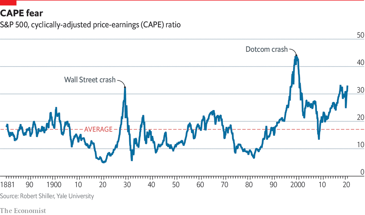
- The CAPE ratio (market-wide P/E multiple) is not as inflated as the 1929 and 2001 crashes
- Also, labeling the average with a red dotted line makes sense, even though it looks like it doesn’t apply anymore . . .
- Expensive stocks do not necessarily mean a crash is close, Economist, 12/4/2020
9. Use maps
- Maps are easy. For example, Americans know where Texas is located
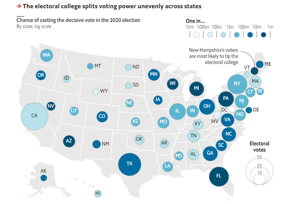
- The US electoral college is the strange system that allocates votes in a “winner-take-all” by state
- So, if you vote Democratic in very Republican state, your vote is essentially useless
- Therefore, voters in “swing states” like PA, FL, MI, WI, AZ, GA have a big marginal impact
- In this graph, the darker color = more likely that your individual vote would decide an election
- How America’s electoral college favours white voters, Economist, 08/15/2021
10. Add trend lines
- Best case = graph speaks for itself. However, it’s okay to nudge the audience and direct their attention
- Yes, lead the witness. No, do not mislead the witness
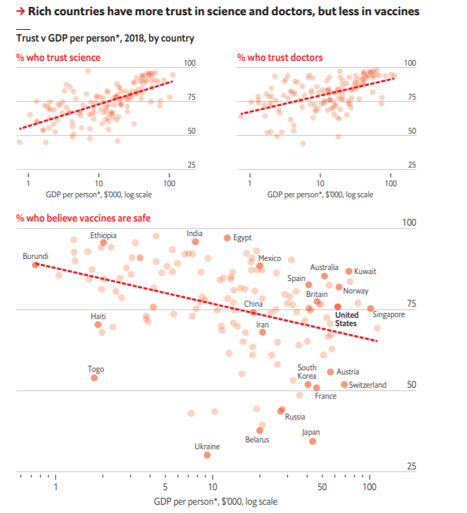
- When your sample size is big enough, add trend lines to show correlations
- When looking at GDP/person, the wealthier countries tend to believe in science and doctors
- In contrast, the wealthier the country, the less likely you believe in vaccines. Fascinating and disturbing
- Conspiracy theories about covid-19 vaccines may prevent herd immunity, Economist, 8/29/2020
11. Delineate history from forecast
- Caveat: data can mislead (think: Mark Twain quote, “lies, damn lies, and statistics”)
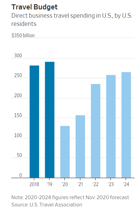
- When you’re showing a forecast, don’t forget to label it differently
- Here the years 2020-2024 are a forecast; noted below and in a lighter color blue
- Covid-19’s Blow to Business Travel Is Expected to Last for Years, WSJ, 1/17/2021
12. Show the data in multiple ways
- Yes, there are many different ways to analyze the same set of data
- While you don’t want to bore the reader, sometimes those different “cuts” are useful to see
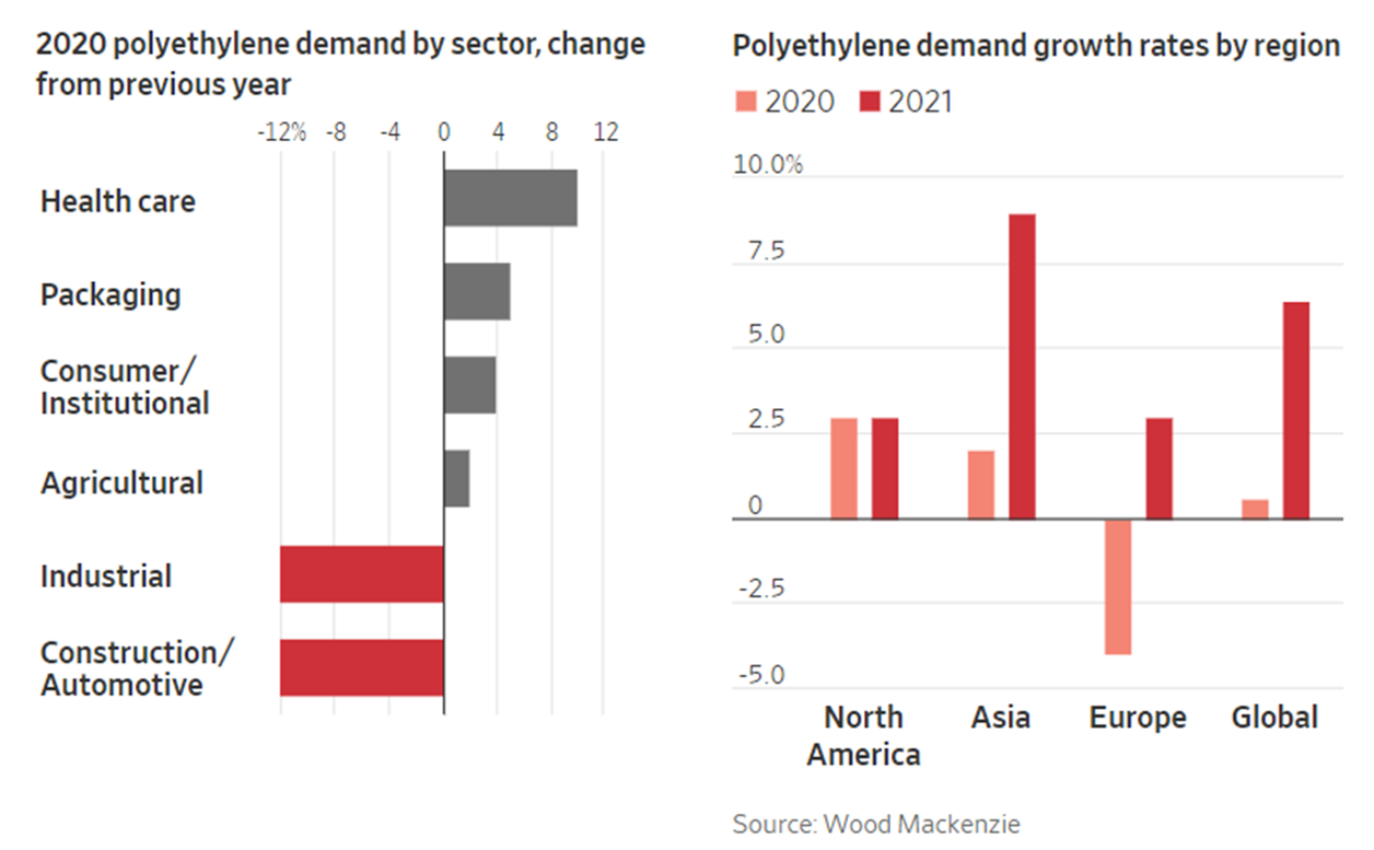
- Polyethylene (plastic) demand varied by sector and by region
- Lots of plastic demand in healthcare and packaging (makes sense) in 2020; in 2021, demand growth will be in Asia
- Firms Like Dow Bet Billions on Plastics. Now There’s a Glut, WSJ, 10/15/2020
13. Label the graph well
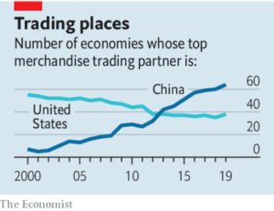
- If you are showing data that requires a little explanation, make a graph title
- The Chinese economy has made remarkable gains over the last 20 years. Looks like China is the top merchandise trading partner with 64 countries, while the US is the #1 speed-dial position for only 38 countries
- How to deal with China, Economist, 1/9/2021
14. Use two graphs, not one
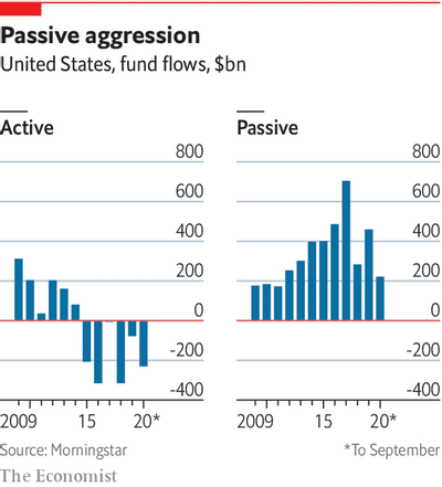
- There is nothing wrong with making multiple graphs and putting them next to each other
- See this side-by-side comparison of managed money; active going down, passive going up
- Apparently, there is $100 trillion in managed assets with increasing consolidation by the big names
- The money doctors, Economist, 11/12/2020
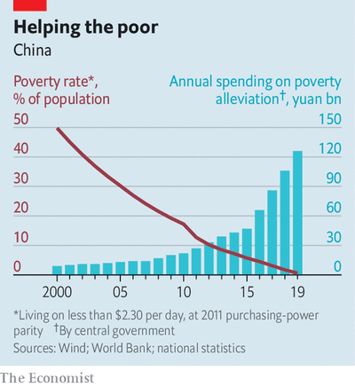
15. If you must have two axes, label them clearly
- Generally, I am not a fan of double axes because it has the potential to confuse the reader
- If you’re going to show two different things, label them in different color; red vs. blue
- Good job China; bringing 800M+ people out of extreme poverty
- Extreme poverty is history in China, officials say, Economist, 1/2/2021
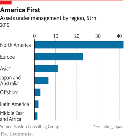
16. Careful how you “bucket” the data
- Consulting is all about putting things into buckets
- Here assets under management (AUM) is categorized by region, with the exception of Japan
- Question: Why is Japan grouped with Australia and not Asia?
- The Shanghai Open, Economist, 11/12/2020
17. Pair up charts
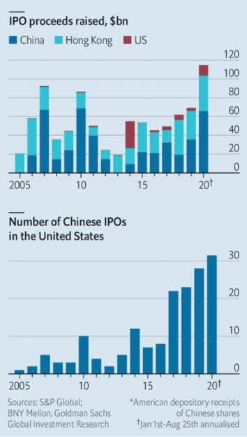
- As a consultant, nothing is better that proactively answering a client’s question before they get a chance to ask
- The first graph is of IPO proceeds raised by Chinese companies; 2020 was the highest at $110B+
- The second graph answers the question of how many US listings (ADR) over the same time period
- Why Chinese firms still flock to American stock exchanges, 10/17/2021
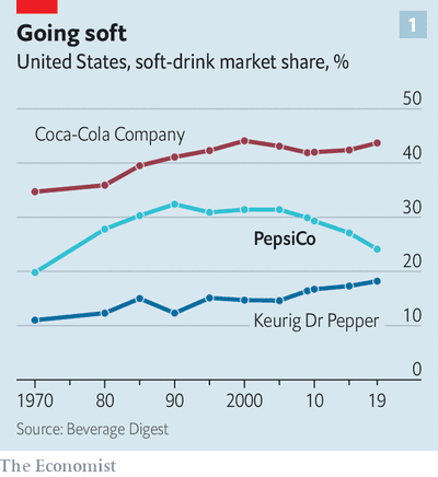
18. Don’t use pie charts
- I remember when a senior manager once told me that pie charts weren’t that useful
- Now, I completely agree now. . .trend lines are WAY better because they provide context
- See market share of beverage over time; what’s up Pepsi?
- How Donald Kendall, as PepsiCo’s boss, sparked the cola wars, 09/26/2020
19. Surprise the reader
- Be creative with your data sets and comparison
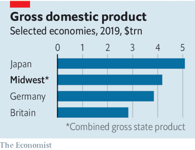
- The Midwest United States is a vibrant (often overlooked) part of the economy
- Comparing it to countries (i.e., Japan, Germany) helps to deliver the message
- The best-run cities of America’s Midwest offer lessons in recovery, 7/25/2020
20. Put things in the appendix
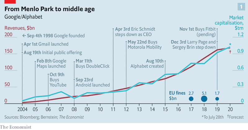
- This is a timeline of Google, which is an eyeful. Probably deserves to be in the appendix, not the main presentation
- It doesn’t convincingly answer the question “So What?”
- Google’s problems are bigger than just the antitrust case, Economist, 7/30/2020
21. Sometimes a table is better
- A mentor of mine always says that tables are underrated. I agree completely
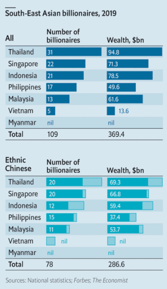
- If you are showing a bunch of numbers (see the graphic below of 32 numbers), why not just put it in a table
- Also, I had no idea that Thailand has so many billionaires
- South-East Asian tycoons’ high-wire act, Economist, 5/8/2020

Can you do all these charts and graphs in excel or need software like Tableau?
Thanks,
Sam
The majority of the charts are line, bar, or scatterplots that can be done by excel. The Economist has a few that require fancier tools. In consulting, and my business experience, the simpler the better.
This is honestly so helpful. The concise and direct-to-the-point blog incapsulates 90% of the essence of my 400-level Data Visualization course. Shared with my friends who also spend days and nights making slides for work!
Winning, thanks for reading.